All examples / feature card
Dusk sync: laptop to phone, dark palette
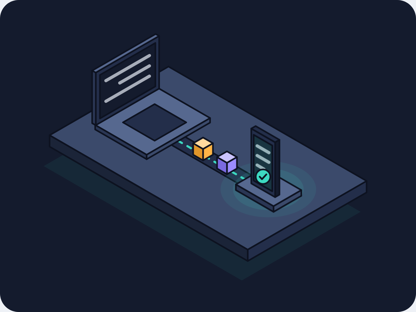
The isometric sync scene redrawn at night: on a dark navy card, teal, violet and amber blocks slide along a glowing teal dashed track from the laptop to the phone, and a soft teal glow swells around the phone as each one lands.
Prompt tested
Feature card size
Prompt
Draw a looping isometric illustration for a 'Sync' feature card in a dark 'Dusk' palette (night mode, for a developer tool), as one inline SVG with CSS keyframes only (no JavaScript, no libraries). Draw the card background first: a rounded rectangle in night #141B2D filling the whole viewBox. On it, a steel-blue isometric platform (30° projection) holding a laptop on the left with its screen facing right and a phone standing in a small dock on the right; both have dark night-coloured screens with a few light mist text lines, and the phone has a teal check badge. A dark groove runs between them with a teal dashed centre line. Three small isometric cubes (teal, violet, amber) slide along the track from the laptop to the phone, evenly spaced, fading in at the laptop and fading out into the phone. The laptop screen tints teal as each cube leaves, and a soft teal glow around the phone's base (three stacked translucent teal ellipses, no blur filter) swells once as each cube arrives. Use a very dark outline (#0D1220, 1.5 px, round joins) and the Dusk palette night #141B2D, deep #232E4A, steel #3B4A6B, mist #E6ECF5, teal #3DD9C1, violet #9B8CFF, amber #FFB547; shade each box with a lighter top, mid right face and darker left face. Loop every 6 seconds with no visible jump; animate only transform and opacity, one gentle fade per glow cycle (no flashing); add a prefers-reduced-motion rule that stops all animation and leaves a calm still frame with the cubes spread along the track.
Words it rests on
- dark palette (Dusk): night background, steel faces, teal accent
- isometric illustration (30° projection)
- card background drawn as the first SVG shape
- soft glow from stacked translucent shapes (no filter)
- inline SVG
- CSS @keyframes
- staggered animation-delay
- seamless loop
- prefers-reduced-motion still frame
- feature card
Prompt test
A fresh AI session given only this prompt rebuilt this on 2026-11-04 using claude-opus-5-5; a separate fresh session using claude-opus-5-5 judged it “like this”.
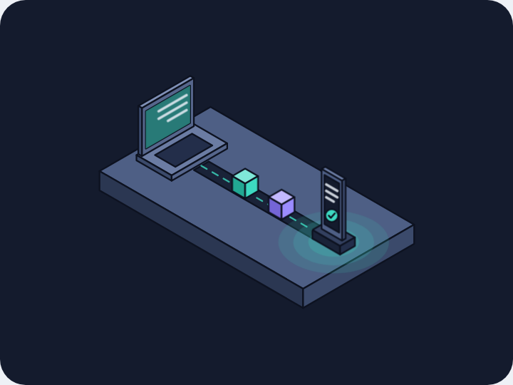
Lesson: Switching palette took three things in the prompt: a name and a mood ('dark Dusk palette, night mode, for a developer tool'), the hex list, and 'draw the card background first' so the dark card exists at all on a light page. The glow came back as asked because the prompt said how to make it ('three stacked translucent ellipses, no blur filter'); the timing of the small extras (screen tints) drifted, as it does when it is not tied to an event.
Facts
- Tags
- feature card css keyframes inline svg isometric flat shaded dusk
- Weight
- 2 KB gzip (SVG + CSS)
- Needs
- No library, no JavaScript
- Browser support
- All current browsers (Chrome, Edge, Firefox, Safari 15+); CSS transforms on SVG groups.
- Loop
- 6 s, seamless; still frame with reduced motion
- Link
/examples/iso-dusk-sync/
Source
Paste both parts into any page. Wrap the SVG in <div class="ma-iso-dusk-sync"> and put the CSS in a <style> element or your stylesheet; every class, id and animation name starts with ma-iso-dusk-sync, so it will not clash with your styles.
demo.svg
<svg xmlns="http://www.w3.org/2000/svg" viewBox="0 0 400 300" role="img" aria-labelledby="ma-iso-dusk-sync-title">
<title id="ma-iso-dusk-sync-title">Two devices on a dark isometric platform with glowing data blocks moving from the laptop to the phone</title>
<rect width="400" height="300" rx="18" fill="#141B2D"/>
<g stroke="#0D1220" stroke-width="1.5" stroke-linejoin="round">
<path d="M156.3 93.7L346.8 203.7L232.5 269.7L42 159.7Z" fill="#3DD9C1" opacity=".07" stroke="none"/>
<path d="M352.5 185L238.2 251L238.2 240L352.5 174Z" fill="#232E4A"/>
<path d="M47.7 141L238.2 251L238.2 240L47.7 130Z" fill="#1B2438"/>
<path d="M162 64L352.5 174L238.2 240L47.7 130Z" fill="#3B4A6B"/>
<path d="M176.3 130.6L244.9 170.2L231.5 177.9L163 138.3Z" fill="#232E4A"/>
<path d="M171.5 135.5L236.3 172.9" fill="none" stroke="#3DD9C1" stroke-width="2" stroke-dasharray="4 6" stroke-linecap="round"/>
<g class="ma-iso-dusk-sync-glow" opacity=".2" stroke="none">
<ellipse cx="258" cy="182" rx="46" ry="27" fill="#3DD9C1" opacity=".12"/>
<ellipse cx="258" cy="182" rx="34" ry="20" fill="#3DD9C1" opacity=".16"/>
<ellipse cx="258" cy="182" rx="22" ry="13" fill="#3DD9C1" opacity=".22"/>
</g>
<g class="ma-iso-dusk-sync-laptop">
<path d="M202 117.9L141 153.1L141 148.7L202 113.5Z" fill="#3B4A6B"/>
<path d="M91.5 124.5L141 153.1L141 148.7L91.5 120.1Z" fill="#2A3654"/>
<path d="M152.5 84.9L202 113.5L141 148.7L91.5 120.1Z" fill="#56688F"/>
<path d="M148.7 100.1L179.1 117.7L148.7 135.3L118.2 117.7Z" fill="#232E4A"/>
<path d="M153 85.2L92.1 120.4L92.1 69.8L153 34.6Z" fill="#232E4A"/>
<path d="M88.6 118.5L92.1 120.4L92.1 69.8L88.6 67.9Z" fill="#2A3654"/>
<path d="M149.6 32.7L153 34.6L92.1 69.8L88.6 67.9Z" fill="#56688F"/>
<path d="M149.4 83.1L96.1 113.9L96.1 72.1L149.4 41.3Z" fill="#141B2D"/>
<path d="M143.7 53.4L101.8 77.6" stroke="#E6ECF5" stroke-width="3" stroke-linecap="round" opacity=".7"/>
<path d="M143.7 63.3L115.1 79.8" stroke="#E6ECF5" stroke-width="3" stroke-linecap="round" opacity=".7"/>
<path d="M143.7 73.2L101.8 97.4" stroke="#E6ECF5" stroke-width="3" stroke-linecap="round" opacity=".7"/>
<g class="ma-iso-dusk-sync-send" opacity=".35">
<path d="M149.4 83.1L96.1 113.9L96.1 72.1L149.4 41.3Z" fill="#3DD9C1"/>
</g>
</g>
<g class="ma-iso-dusk-sync-block ma-iso-dusk-sync-block-1">
<path d="M239.3 168.7L229.8 174.2L229.8 163.2L239.3 157.7Z" fill="#3DD9C1"/>
<path d="M220.2 168.7L229.8 174.2L229.8 163.2L220.2 157.7Z" fill="#26B39D"/>
<path d="M229.8 152.2L239.3 157.7L229.8 163.2L220.2 157.7Z" fill="#9BEFE2"/>
</g>
<g class="ma-iso-dusk-sync-block ma-iso-dusk-sync-block-2">
<path d="M216.3 155.4L206.7 160.9L206.7 149.9L216.3 144.4Z" fill="#9B8CFF"/>
<path d="M197.2 155.4L206.7 160.9L206.7 149.9L197.2 144.4Z" fill="#7A6AE0"/>
<path d="M206.7 138.9L216.3 144.4L206.7 149.9L197.2 144.4Z" fill="#CBC3FF"/>
</g>
<g class="ma-iso-dusk-sync-block ma-iso-dusk-sync-block-3">
<path d="M193.2 142.1L183.7 147.6L183.7 136.6L193.2 131.1Z" fill="#FFB547"/>
<path d="M174.2 142.1L183.7 147.6L183.7 136.6L174.2 131.1Z" fill="#E0952A"/>
<path d="M183.7 125.6L193.2 131.1L183.7 136.6L174.2 131.1Z" fill="#FFD99E"/>
</g>
<g class="ma-iso-dusk-sync-phone">
<path d="M289.7 188.3L263 203.7L263 198.2L289.7 182.8Z" fill="#3B4A6B"/>
<path d="M226.8 182.8L263 203.7L263 198.2L226.8 177.3Z" fill="#2A3654"/>
<path d="M253.5 161.9L289.7 182.8L263 198.2L226.8 177.3Z" fill="#56688F"/>
<path d="M268.7 187.2L264.5 189.6L264.5 136.8L268.7 134.4Z" fill="#141B2D"/>
<path d="M241.6 176.4L264.5 189.6L264.5 136.8L241.6 123.6Z" fill="#232E4A"/>
<path d="M245.8 121.2L268.7 134.4L264.5 136.8L241.6 123.6Z" fill="#232E4A"/>
<path d="M243.9 173.6L261.8 183.9L261.8 139.9L243.9 129.6Z" fill="#141B2D"/>
<path d="M247.2 140.2L258.6 146.8" stroke="#E6ECF5" stroke-width="3" stroke-linecap="round" opacity=".7"/>
<path d="M247.2 149.5L258.6 156.1" stroke="#E6ECF5" stroke-width="3" stroke-linecap="round" opacity=".7"/>
<path d="M247.2 158.7L253.8 162.6" stroke="#E6ECF5" stroke-width="3" stroke-linecap="round" opacity=".7"/>
<g class="ma-iso-dusk-sync-receive" opacity=".25">
<path d="M243.9 173.6L261.8 183.9L261.8 139.9L243.9 129.6Z" fill="#3DD9C1"/>
</g>
<circle cx="252.9" cy="169.9" r="7" fill="#3DD9C1" stroke="#0D1220" stroke-width="1.5"/>
<path d="M249.7 169.9l2.2 2.4 4.2-4.6" fill="none" stroke="#0D1220" stroke-width="1.6" stroke-linecap="round" stroke-linejoin="round"/>
</g>
</g>
</svg>
demo.css
/* Dark isometric sync card (Dusk palette): data blocks travel from the laptop to the phone, one every 2 s.
   Loop period 6 s; the negative delays make the first frame match the still frame. Only transform and opacity animate. */
.ma-iso-dusk-sync svg {
  display: block;
  width: 100%;
  height: auto;
}

.ma-iso-dusk-sync .ma-iso-dusk-sync-block {
  animation-duration: 6s;
  animation-timing-function: linear;
  animation-iteration-count: infinite;
}

.ma-iso-dusk-sync .ma-iso-dusk-sync-block-1 {
  animation-name: ma-iso-dusk-sync-travel-1;
  animation-delay: -4.48s;
}

.ma-iso-dusk-sync .ma-iso-dusk-sync-block-2 {
  animation-name: ma-iso-dusk-sync-travel-2;
  animation-delay: -2.48s;
}

.ma-iso-dusk-sync .ma-iso-dusk-sync-block-3 {
  animation-name: ma-iso-dusk-sync-travel-3;
  animation-delay: -0.48s;
}

/* Each block starts at the laptop, slides to the dock and fades into the phone. */
@keyframes ma-iso-dusk-sync-travel-1 {
  0%, 100% { transform: translate(-51.6px, -29.8px); opacity: 0; }
  10% { opacity: 1; }
  80% { transform: translate(3.7px, 2.1px); opacity: 1; }
  90% { transform: translate(3.7px, 2.1px); opacity: 0; }
}

@keyframes ma-iso-dusk-sync-travel-2 {
  0%, 100% { transform: translate(-28.5px, -16.5px); opacity: 0; }
  10% { opacity: 1; }
  80% { transform: translate(26.7px, 15.4px); opacity: 1; }
  90% { transform: translate(26.7px, 15.4px); opacity: 0; }
}

@keyframes ma-iso-dusk-sync-travel-3 {
  0%, 100% { transform: translate(-5.5px, -3.2px); opacity: 0; }
  10% { opacity: 1; }
  80% { transform: translate(49.7px, 28.7px); opacity: 1; }
  90% { transform: translate(49.7px, 28.7px); opacity: 0; }
}

/* The laptop screen lights up teal as each block leaves; the phone screen and the teal glow
   around the phone swell once as it lands. The glow is stacked translucent ellipses, so only
   opacity animates (no filter). */
.ma-iso-dusk-sync .ma-iso-dusk-sync-send,
.ma-iso-dusk-sync .ma-iso-dusk-sync-receive,
.ma-iso-dusk-sync .ma-iso-dusk-sync-glow {
  animation-duration: 2s;
  animation-timing-function: ease-in-out;
  animation-iteration-count: infinite;
}

.ma-iso-dusk-sync .ma-iso-dusk-sync-send {
  animation-name: ma-iso-dusk-sync-send;
}

.ma-iso-dusk-sync .ma-iso-dusk-sync-receive {
  animation-name: ma-iso-dusk-sync-receive;
}

.ma-iso-dusk-sync .ma-iso-dusk-sync-glow {
  animation-name: ma-iso-dusk-sync-glow;
}

@keyframes ma-iso-dusk-sync-send {
  0%, 100% { opacity: 0.15; }
  10% { opacity: 0; }
  70% { opacity: 0; }
  86% { opacity: 0.45; }
}

@keyframes ma-iso-dusk-sync-receive {
  0%, 100% { opacity: 0; }
  10% { opacity: 0; }
  30% { opacity: 0.6; }
  60% { opacity: 0; }
}

@keyframes ma-iso-dusk-sync-glow {
  0%, 100% { opacity: 0.2; }
  15% { opacity: 0.2; }
  35% { opacity: 1; }
  75% { opacity: 0.2; }
}

/* Calm still frame: the markup's resting state shows three blocks on their way and a faint glow. */
@media (prefers-reduced-motion: reduce) {
  .ma-iso-dusk-sync,
  .ma-iso-dusk-sync * {
    animation: none !important;
  }
}
Same idea, other ways
Say 'dark Dusk palette, night background drawn as the first shape, teal glow from stacked translucent shapes' to keep the same isometric scene but turn it into a night-mode card for a developer tool.
- Isometric sync: laptop to phone isometric, flat shaded, harbor
- Flat sync: laptop to phone flat vector, harbor
- Line-art sync: laptop to phone line art, harbor
- Clay sync: laptop to phone clay, harbor
- Glass sync: laptop to phone glass, harbor