All examples / feature card
Clay sync: laptop to phone
A soft clay, 3D-pastel laptop and phone on a rounded slab with a blurred contact shadow; chunky clay blocks slide along a rail from the laptop into the phone, which squashes gently as each one lands.
Prompt tested
Feature card size
Prompt
Draw a looping soft clay / 3D-pastel illustration (chunky rounded shapes, radial-gradient shading with a light top-left highlight, a soft blurred contact shadow, no outlines, front three-quarter feel, not isometric line work) for a 'Sync' feature card in the Harbor palette, as one inline SVG animated with CSS keyframes only (no JavaScript, no libraries). Scene, on a paper-coloured rounded card: a fat rounded clay slab (pill shape, white-to-warm-beige radial gradient) with a static blurred navy shadow under it (an SVG feGaussianBlur filter on a shape that never moves). On the slab a laptop on the left (a very rounded slate screen with a sky-blue display showing three thick paper bars, sitting on a thick rounded pale grey-blue base) and an upright chunky phone on the right (rounded slate body, sky-blue screen with two paper bars and a mint clay badge holding a thick paper check); a soft white gloss ellipse on top of each device. Between them a low rounded beige rail. Three soft rounded clay blocks (mint, warm yellow, coral, each with its own radial gradient) slide along the rail from the laptop to the phone, one leaving every 2 seconds; draw the devices on top of the rail so each block slips out from behind the laptop and disappears behind the phone. As each block lands the phone does a small squash and settle (scale about 1.05 by 0.93 from its bottom edge, then back), and its screen softly glows mint; the laptop screen brightens briefly as each block leaves. Colours: ink #1F2A44, slate #5B6B8C, sky #7FB6FF, mint #6FD6B4, sun #FFC861, coral #FF8A7A, paper #F6F4EF, with lighter tints for highlights. Never animate a filter. Loop every 6 seconds with no visible jump; animate only transform and opacity; add a prefers-reduced-motion rule that stops all animation and leaves a calm still frame with the three blocks spread along the rail.
Words it rests on
- clay / 3D-pastel illustration
- radial-gradient shading
- soft blurred contact shadow (static)
- chunky rounded shapes
- squash and settle
- transform-origin at the bottom edge
- inline SVG
- CSS @keyframes
- prefers-reduced-motion still frame
- feature card
Prompt test
A fresh AI session given only this prompt rebuilt this on 2026-11-04 using claude-opus-5-5; a separate fresh session using claude-opus-5-5 judged it “like this”.
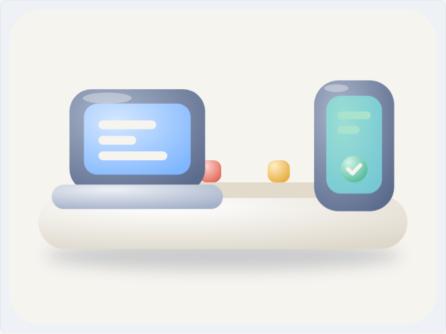
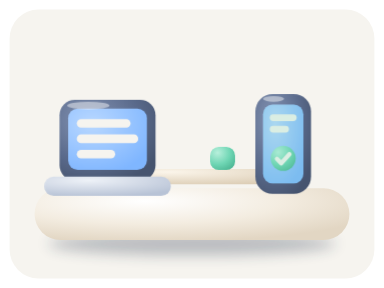
Lesson: The clay look came back from three phrases: 'radial-gradient shading with a light top-left highlight', 'a soft blurred contact shadow' on a static shape, and 'chunky rounded shapes'. Giving the squash as numbers ('about 1.05 by 0.93 from its bottom edge, then back') reproduced it exactly. As in the flat version, 'one leaving every 2 seconds' did not fix the travel time, so the rebuild sent one quick block at a time; say 'each block takes about 5 s to cross' to get several on the rail at once.
Facts
- Tags
- feature card css keyframes inline svg svg gradients clay harbor
- Weight
- 1.8 KB gzip (SVG + CSS)
- Needs
- No library, no JavaScript
- Browser support
- All current browsers (Chrome, Edge, Firefox, Safari 15+); CSS transforms with transform-box on SVG groups, SVG radial gradients and a static blur filter.
- Loop
- 6 s, seamless; still frame with reduced motion
- Link
/examples/clay-sync/
Source
Paste both parts into any page. Wrap the SVG in <div class="ma-clay-sync"> and put the CSS in a <style> element or your stylesheet; every class, id and animation name starts with ma-clay-sync, so it will not clash with your styles.
demo.svg
<svg xmlns="http://www.w3.org/2000/svg" viewBox="0 0 400 300" role="img" aria-labelledby="ma-clay-sync-title">
<title id="ma-clay-sync-title">A soft clay laptop and phone on a rounded slab; clay data blocks slide from the laptop into the phone, which squashes gently as each one lands</title>
<defs>
<radialGradient id="ma-clay-sync-slate" cx=".3" cy=".25" r=".9"><stop offset="0" stop-color="#A9B4CA"/><stop offset="1" stop-color="#5B6B8C"/></radialGradient>
<radialGradient id="ma-clay-sync-sky" cx=".3" cy=".25" r=".9"><stop offset="0" stop-color="#D6E8FF"/><stop offset="1" stop-color="#7FB6FF"/></radialGradient>
<radialGradient id="ma-clay-sync-paper" cx=".35" cy=".2" r=".9"><stop offset="0" stop-color="#FFFFFF"/><stop offset="1" stop-color="#DED8CB"/></radialGradient>
<radialGradient id="ma-clay-sync-base" cx=".35" cy=".2" r=".9"><stop offset="0" stop-color="#EEF1F6"/><stop offset="1" stop-color="#A3B0C8"/></radialGradient>
<radialGradient id="ma-clay-sync-mint" cx=".3" cy=".25" r=".85"><stop offset="0" stop-color="#D2F5E8"/><stop offset="1" stop-color="#4FB896"/></radialGradient>
<radialGradient id="ma-clay-sync-sun" cx=".3" cy=".25" r=".85"><stop offset="0" stop-color="#FFEDC4"/><stop offset="1" stop-color="#E8AC3E"/></radialGradient>
<radialGradient id="ma-clay-sync-coral" cx=".3" cy=".25" r=".85"><stop offset="0" stop-color="#FFD6CF"/><stop offset="1" stop-color="#E06A5B"/></radialGradient>
<filter id="ma-clay-sync-soft" x="-20%" y="-100%" width="140%" height="300%"><feGaussianBlur stdDeviation="7"/></filter>
</defs>
<rect x="8" y="8" width="384" height="284" rx="28" fill="#F6F4EF"/>
<ellipse cx="200" cy="230" rx="160" ry="13" fill="#1F2A44" opacity=".2" filter="url(#ma-clay-sync-soft)"/>
<rect x="34" y="176" width="332" height="48" rx="24" fill="url(#ma-clay-sync-paper)"/>
<rect x="172" y="164" width="124" height="14" rx="7" fill="#E2DACB"/>
<g class="ma-clay-sync-block ma-clay-sync-block-1"><rect x="258" y="144" width="20" height="20" rx="7" fill="url(#ma-clay-sync-mint)"/></g>
<g class="ma-clay-sync-block ma-clay-sync-block-2"><rect x="226" y="144" width="20" height="20" rx="7" fill="url(#ma-clay-sync-sun)"/></g>
<g class="ma-clay-sync-block ma-clay-sync-block-3"><rect x="194" y="144" width="20" height="20" rx="7" fill="url(#ma-clay-sync-coral)"/></g>
<g class="ma-clay-sync-laptop">
<rect x="62" y="80" width="122" height="92" rx="20" fill="url(#ma-clay-sync-slate)"/>
<rect x="75" y="93" width="96" height="64" rx="12" fill="url(#ma-clay-sync-sky)"/>
<rect x="88" y="108" width="52" height="8" rx="4" fill="#F6F4EF"/>
<rect x="88" y="122" width="34" height="8" rx="4" fill="#F6F4EF"/>
<rect x="88" y="136" width="62" height="8" rx="4" fill="#F6F4EF"/>
<g class="ma-clay-sync-send" opacity=".3"><rect x="75" y="93" width="96" height="64" rx="12" fill="#F6F4EF"/></g>
<rect x="46" y="166" width="154" height="22" rx="11" fill="url(#ma-clay-sync-base)"/>
<ellipse cx="96" cy="88" rx="22" ry="5" fill="#FFFFFF" opacity=".35"/>
</g>
<g class="ma-clay-sync-phone">
<rect x="282" y="72" width="72" height="118" rx="22" fill="url(#ma-clay-sync-slate)"/>
<rect x="293" y="86" width="50" height="88" rx="13" fill="url(#ma-clay-sync-sky)"/>
<rect x="303" y="100" width="30" height="7" rx="3.5" fill="#F6F4EF"/>
<rect x="303" y="113" width="20" height="7" rx="3.5" fill="#F6F4EF"/>
<g class="ma-clay-sync-receive" opacity=".25"><rect x="293" y="86" width="50" height="88" rx="13" fill="#6FD6B4"/></g>
<circle cx="318" cy="152" r="12" fill="url(#ma-clay-sync-mint)"/>
<path d="M312.5 152l4 4 7-7.5" fill="none" stroke="#F6F4EF" stroke-width="3.5" stroke-linecap="round" stroke-linejoin="round"/>
<ellipse cx="302" cy="79" rx="11" ry="3.5" fill="#FFFFFF" opacity=".35"/>
</g>
</svg>
demo.css
/* Clay sync card: soft clay blocks slide from the laptop into the phone, one every 2 s; the phone squashes
   a little as each one lands. Loop period 6 s. The devices are drawn over the rail, so each block slips out
   of the laptop and into the phone. Only transform and opacity animate; the blurred contact shadow never moves. */
.ma-clay-sync svg {
  display: block;
  width: 100%;
  height: auto;
}

.ma-clay-sync .ma-clay-sync-block {
  animation-duration: 6s;
  animation-timing-function: linear;
  animation-iteration-count: infinite;
}

.ma-clay-sync .ma-clay-sync-block-1 {
  animation-name: ma-clay-sync-travel-1;
  animation-delay: -3.6s;
}

.ma-clay-sync .ma-clay-sync-block-2 {
  animation-name: ma-clay-sync-travel-2;
  animation-delay: -1.6s;
}

.ma-clay-sync .ma-clay-sync-block-3 {
  animation-name: ma-clay-sync-travel-3;
  animation-delay: -5.6s;
}

@keyframes ma-clay-sync-travel-1 {
  0%, 100% { transform: translateX(-98px); opacity: 0; }
  8% { opacity: 1; }
  80% { transform: translateX(50px); opacity: 1; }
  90% { transform: translateX(50px); opacity: 0; }
}

@keyframes ma-clay-sync-travel-2 {
  0%, 100% { transform: translateX(-66px); opacity: 0; }
  8% { opacity: 1; }
  80% { transform: translateX(82px); opacity: 1; }
  90% { transform: translateX(82px); opacity: 0; }
}

@keyframes ma-clay-sync-travel-3 {
  0%, 100% { transform: translateX(-34px); opacity: 0; }
  8% { opacity: 1; }
  80% { transform: translateX(114px); opacity: 1; }
  90% { transform: translateX(114px); opacity: 0; }
}

/* A small squash and settle as each block lands, anchored at the phone's bottom edge. */
.ma-clay-sync .ma-clay-sync-phone {
  transform-box: fill-box;
  transform-origin: 50% 100%;
  animation-name: ma-clay-sync-squash;
  animation-duration: 2s;
  animation-timing-function: ease-in-out;
  animation-iteration-count: infinite;
  animation-delay: -1.65s;
}

@keyframes ma-clay-sync-squash {
  0%, 100% { transform: scale(1, 1); }
  8% { transform: scale(1.05, 0.93); }
  18% { transform: scale(0.98, 1.03); }
  28% { transform: scale(1, 1); }
}

/* The laptop screen brightens as each block leaves; the phone screen glows as it lands. */
.ma-clay-sync .ma-clay-sync-send,
.ma-clay-sync .ma-clay-sync-receive {
  animation-duration: 2s;
  animation-timing-function: ease-in-out;
  animation-iteration-count: infinite;
}

.ma-clay-sync .ma-clay-sync-send {
  animation-name: ma-clay-sync-send;
  animation-delay: -1.42s;
}

.ma-clay-sync .ma-clay-sync-receive {
  animation-name: ma-clay-sync-receive;
  animation-delay: -1.7s;
}

@keyframes ma-clay-sync-send {
  0%, 100% { opacity: 0.15; }
  10% { opacity: 0; }
  70% { opacity: 0; }
  86% { opacity: 0.45; }
}

@keyframes ma-clay-sync-receive {
  0%, 100% { opacity: 0; }
  10% { opacity: 0; }
  30% { opacity: 0.6; }
  60% { opacity: 0; }
}

/* Calm still frame: the markup's resting state shows three blocks spread along the rail. */
@media (prefers-reduced-motion: reduce) {
  .ma-clay-sync,
  .ma-clay-sync * {
    animation: none !important;
  }
}
Same idea, other ways
Say 'soft clay / 3D-pastel, chunky rounded shapes, radial-gradient shading, a blurred contact shadow' and 'squash and settle as it lands' to trade sharp outlined boxes for soft toy-like forms that react with a little bounce.
- Isometric sync: laptop to phone isometric, flat shaded, harbor
- Dusk sync: laptop to phone, dark palette isometric, flat shaded, dusk
- Flat sync: laptop to phone flat vector, harbor
- Line-art sync: laptop to phone line art, harbor
- Glass sync: laptop to phone glass, harbor