All examples / feature card
Flat sync: laptop to phone
A flat, front-view laptop and phone with no outlines and no depth; rounded data blocks slide along a dotted line from the laptop to the phone, one every two seconds, and the phone screen glows as each one lands.
Prompt tested
Feature card size
Prompt
Draw a looping flat vector illustration (front view, no outlines, no depth faces, no isometric angle) for a 'Sync' feature card in the Harbor palette, as one inline SVG animated with CSS keyframes only (no JavaScript, no libraries). Scene, on a paper-coloured rounded card with one large pale sky-blue circle behind: a laptop on the left seen straight from the front (a slate rounded-rectangle screen with a sky-blue display showing three paper-coloured text bars, sitting on a wide flat pale grey-blue base), and a phone standing upright on the right (a navy rounded body, sky-blue screen with three short bars and a mint circle holding a navy check near the bottom). A faint flat ground bar runs under both. Between them a straight horizontal dotted line in sky blue (round dots). Three small rounded squares (mint, warm yellow, coral) slide along the line from the laptop to the phone, one leaving every 2 seconds; draw the devices on top of the line so each square slips out from behind the laptop screen and disappears behind the phone, fading in and out at the ends. The laptop screen brightens briefly as each square leaves and the phone screen softly glows mint as each one arrives. Use flat colour fills only, rounded corners everywhere, and the palette ink #1F2A44, slate #5B6B8C, sky #7FB6FF, mint #6FD6B4, sun #FFC861, coral #FF8A7A, paper #F6F4EF. Loop every 6 seconds with no visible jump; animate only transform and opacity; add a prefers-reduced-motion rule that stops all animation and leaves a calm still frame with the three squares spread along the line.
Words it rests on
- flat vector illustration
- front view, no depth
- no outlines (fills only)
- rounded shapes
- inline SVG
- CSS @keyframes
- staggered animation-delay
- layering to hide entry and exit
- prefers-reduced-motion still frame
- feature card
Prompt test
A fresh AI session given only this prompt rebuilt this on 2026-11-04 using claude-opus-5-5; a separate fresh session using claude-opus-5-5 judged it “like this”.

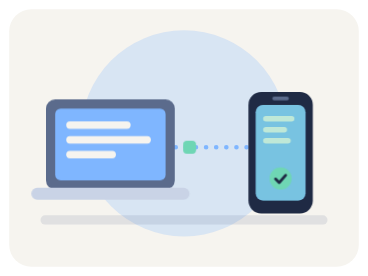
Lesson: To move away from isometric, the prompt had to say what to drop, not only what to draw: 'front view, no outlines, no depth faces, no isometric angle' in the first sentence kept the rebuild flat. Describing the layering trick ('draw the devices on top of the line so each square slips out from behind the laptop') gave the same entry and exit without any clipping. The one-every-2-seconds spacing came back right, but how many squares show at once did not; to get three on screen, give the track length or the travel time.
Facts
- Tags
- feature card css keyframes inline svg flat vector harbor
- Weight
- 1.4 KB gzip (SVG + CSS)
- Needs
- No library, no JavaScript
- Browser support
- All current browsers (Chrome, Edge, Firefox, Safari 15+); CSS transforms on SVG groups.
- Loop
- 6 s, seamless; still frame with reduced motion
- Link
/examples/flat-sync/
Source
Paste both parts into any page. Wrap the SVG in <div class="ma-flat-sync"> and put the CSS in a <style> element or your stylesheet; every class, id and animation name starts with ma-flat-sync, so it will not clash with your styles.
demo.svg
<svg xmlns="http://www.w3.org/2000/svg" viewBox="0 0 400 300" role="img" aria-labelledby="ma-flat-sync-title">
<title id="ma-flat-sync-title">A flat laptop and phone side by side with data blocks sliding along a dotted line from the laptop to the phone</title>
<rect x="8" y="8" width="384" height="284" rx="28" fill="#F6F4EF"/>
<circle cx="200" cy="146" r="118" fill="#7FB6FF" opacity=".14"/>
<rect x="36" y="196" width="328" height="10" rx="5" fill="#1F2A44" opacity=".08"/>
<path d="M192 150H276" fill="none" stroke="#7FB6FF" stroke-width="4" stroke-linecap="round" stroke-dasharray="0 12"/>
<g class="ma-flat-sync-block ma-flat-sync-block-1"><rect x="260" y="142" width="16" height="16" rx="4" fill="#6FD6B4"/></g>
<g class="ma-flat-sync-block ma-flat-sync-block-2"><rect x="228" y="142" width="16" height="16" rx="4" fill="#FFC861"/></g>
<g class="ma-flat-sync-block ma-flat-sync-block-3"><rect x="196" y="142" width="16" height="16" rx="4" fill="#FF8A7A"/></g>
<g class="ma-flat-sync-laptop">
<rect x="56" y="98" width="124" height="86" rx="10" fill="#5B6B8C"/>
<rect x="64" y="106" width="108" height="70" rx="5" fill="#7FB6FF"/>
<rect x="76" y="120" width="60" height="6" rx="3" fill="#F6F4EF" opacity=".9"/>
<rect x="76" y="134" width="40" height="6" rx="3" fill="#F6F4EF" opacity=".9"/>
<rect x="76" y="148" width="72" height="6" rx="3" fill="#F6F4EF" opacity=".9"/>
<g class="ma-flat-sync-send" opacity=".35"><rect x="64" y="106" width="108" height="70" rx="5" fill="#F6F4EF"/></g>
<rect x="40" y="184" width="156" height="12" rx="6" fill="#A3B0C8"/>
<rect x="100" y="184" width="36" height="5" rx="2.5" fill="#8F9BB3"/>
</g>
<g class="ma-flat-sync-phone">
<rect x="282" y="80" width="64" height="116" rx="12" fill="#1F2A44"/>
<rect x="288" y="92" width="52" height="92" rx="6" fill="#7FB6FF"/>
<rect x="304" y="85" width="20" height="3" rx="1.5" fill="#5B6B8C"/>
<rect x="296" y="104" width="34" height="5" rx="2.5" fill="#F6F4EF" opacity=".9"/>
<rect x="296" y="116" width="24" height="5" rx="2.5" fill="#F6F4EF" opacity=".9"/>
<rect x="296" y="128" width="30" height="5" rx="2.5" fill="#F6F4EF" opacity=".9"/>
<g class="ma-flat-sync-receive" opacity=".25"><rect x="288" y="92" width="52" height="92" rx="6" fill="#6FD6B4"/></g>
<circle cx="314" cy="161" r="10" fill="#6FD6B4"/>
<path d="M309.5 161l3 3.2 6-6.4" fill="none" stroke="#1F2A44" stroke-width="2" stroke-linecap="round" stroke-linejoin="round"/>
</g>
</svg>
demo.css
/* Flat sync card: rounded data blocks slide along a dotted line from the laptop to the phone, one every 2 s.
   Loop period 6 s. The devices are drawn over the line, so each block slips out of the laptop and into the phone.
   Only transform and opacity animate. */
.ma-flat-sync svg {
  display: block;
  width: 100%;
  height: auto;
}

.ma-flat-sync .ma-flat-sync-block {
  animation-duration: 6s;
  animation-timing-function: linear;
  animation-iteration-count: infinite;
}

.ma-flat-sync .ma-flat-sync-block-1 {
  animation-name: ma-flat-sync-travel-1;
  animation-delay: -3.6s;
}

.ma-flat-sync .ma-flat-sync-block-2 {
  animation-name: ma-flat-sync-travel-2;
  animation-delay: -1.6s;
}

.ma-flat-sync .ma-flat-sync-block-3 {
  animation-name: ma-flat-sync-travel-3;
  animation-delay: -5.6s;
}

/* Each block starts behind the laptop screen, slides right and ends behind the phone. */
@keyframes ma-flat-sync-travel-1 {
  0%, 100% { transform: translateX(-96px); opacity: 0; }
  8% { opacity: 1; }
  80% { transform: translateX(32px); opacity: 1; }
  90% { transform: translateX(32px); opacity: 0; }
}

@keyframes ma-flat-sync-travel-2 {
  0%, 100% { transform: translateX(-64px); opacity: 0; }
  8% { opacity: 1; }
  80% { transform: translateX(64px); opacity: 1; }
  90% { transform: translateX(64px); opacity: 0; }
}

@keyframes ma-flat-sync-travel-3 {
  0%, 100% { transform: translateX(-32px); opacity: 0; }
  8% { opacity: 1; }
  80% { transform: translateX(96px); opacity: 1; }
  90% { transform: translateX(96px); opacity: 0; }
}

/* The laptop screen brightens as each block leaves; the phone screen glows as it lands. */
.ma-flat-sync .ma-flat-sync-send,
.ma-flat-sync .ma-flat-sync-receive {
  animation-duration: 2s;
  animation-timing-function: ease-in-out;
  animation-iteration-count: infinite;
}

.ma-flat-sync .ma-flat-sync-send {
  animation-name: ma-flat-sync-send;
  animation-delay: -1.42s;
}

.ma-flat-sync .ma-flat-sync-receive {
  animation-name: ma-flat-sync-receive;
  animation-delay: -1.7s;
}

@keyframes ma-flat-sync-send {
  0%, 100% { opacity: 0.15; }
  10% { opacity: 0; }
  70% { opacity: 0; }
  86% { opacity: 0.45; }
}

@keyframes ma-flat-sync-receive {
  0%, 100% { opacity: 0; }
  10% { opacity: 0; }
  30% { opacity: 0.6; }
  60% { opacity: 0; }
}

/* Calm still frame: the markup's resting state shows three blocks spread along the line. */
@media (prefers-reduced-motion: reduce) {
  .ma-flat-sync,
  .ma-flat-sync * {
    animation: none !important;
  }
}
Same idea, other ways
Say 'flat vector, front view, no outlines, no depth faces' to lose the isometric boxes: the same story turns into rounded shapes on one plane, with layering instead of perspective to hide where the blocks come and go.
- Isometric sync: laptop to phone isometric, flat shaded, harbor
- Dusk sync: laptop to phone, dark palette isometric, flat shaded, dusk
- Line-art sync: laptop to phone line art, harbor
- Clay sync: laptop to phone clay, harbor
- Glass sync: laptop to phone glass, harbor