All examples / scroll story
Sticky steps: a picture that builds up step by step
Three short text steps scroll past a sticky isometric picture. As each step enters the view, its own piece rises into the picture: a laptop, then a phone, then a cloud linking the two. Each step's view timeline is shared with the picture through timeline-scope.
Prompt tested
From desk to pocket in three steps
Scroll on: each step adds its piece to the picture.
Step 1
Start on your laptop
Draft the plan where you have room: routes, notes and bookings in one place.
Step 2
Pick it up on your phone
The same plan opens on your phone, ready for the platform or the queue.
Step 3
Kept in sync, quietly
Every change travels both ways through the cloud, so nothing is ever out of date.
Prompt
Build a sticky 'steps' scroll story as one HTML section with CSS only (no JavaScript, no libraries, no scroll event listeners). Markup: a wrapper holding (1) a picture block and (2) a list with a short intro (heading 'From desk to pocket in three steps' and one line) followed by three step blocks, each with a small yellow 'Step n' pill, an h3 and one sentence: 'Start on your laptop', 'Pick it up on your phone', 'Kept in sync, quietly'. Layout: below 768px one column, where the picture is position: sticky; top: 0; 45cqh tall with an opaque paper background and z-index above the text, the intro fills the rest of the first screen (55cqh), and each step is min-height: 80cqh with its text vertically centred, so the steps scroll up underneath the picture; from 768px two columns (CSS grid), the picture sticky on the left at 100cqh tall, the intro (100cqh) and the steps on the right. The picture is one inline SVG of an isometric scene (30° projection): a pale paper platform as the base, then three layers, each in its own <g>: layer 1 an open laptop with a sky-blue screen on the left of the platform, layer 2 a phone with a mint screen standing in a slate dock on the right, layer 3 a pale blue cloud with a slate two-arrow sync icon floating above, joined to the laptop and the phone by two dashed sky-blue lines. Motion: give step n view-timeline-name: --step-n, put timeline-scope: --step-1, --step-2, --step-3 on the shared wrapper so the picture (a sibling, not a descendant of the steps) can use those timelines, and give layer n animation-timeline: --step-n with animation-range: entry 40% entry 100%, animation-duration: auto and animation-fill-mode: both; each layer rises 24px and fades in from opacity 0 to its base, one animation per layer and no fade-out, so the picture builds up step by step. Animate only transform and opacity. The base styles are the finished picture with all three layers: put only the animation lines (timeline-scope, view-timeline-name, animation-*) inside @supports (animation-timeline: view()) and (timeline-scope: none), so other browsers show the whole picture and every step readable, and add a prefers-reduced-motion rule that sets animation: none. Size heights in cqh (no vh units), use no overflow: hidden/auto and no position: fixed. Use a navy outline (#1F2A44, 1.5 px, round joins) and the palette ink #1F2A44, slate #5B6B8C, sky #7FB6FF, mint #6FD6B4, sun #FFC861, coral #FF8A7A, paper #F6F4EF; shade each box with a light top, mid right face and darker left face.
Words it rests on
- sticky steps story (scrollytelling)
- position: sticky picture beside scrolling text steps
- named view timeline per step (view-timeline-name)
- timeline-scope (share a timeline with a sibling)
- animation-range: entry 40% entry 100%
- animation-duration: auto, animation-fill-mode: both
- build-up picture: one layer per step, no fade-out
- @supports (animation-timeline: view()) and (timeline-scope: none) fallback: finished picture
- cqh units instead of vh
- isometric illustration (30° projection)
Prompt test
A fresh AI session given only this prompt rebuilt this on 2026-11-05 using claude-opus-5-5; a separate fresh session using claude-opus-5-5 judged it “like this”.
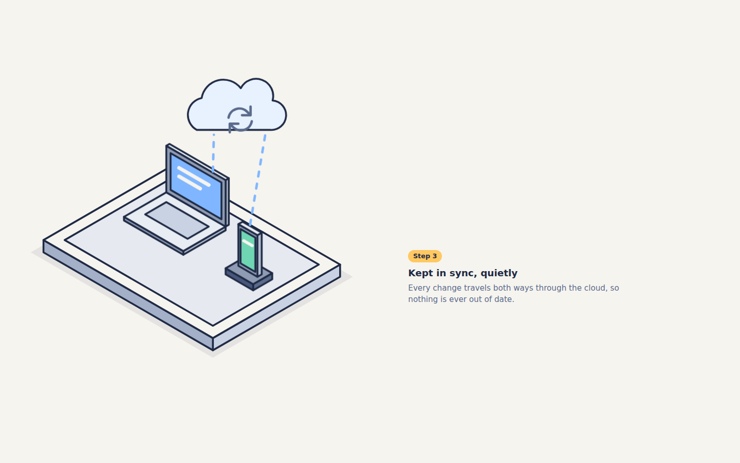
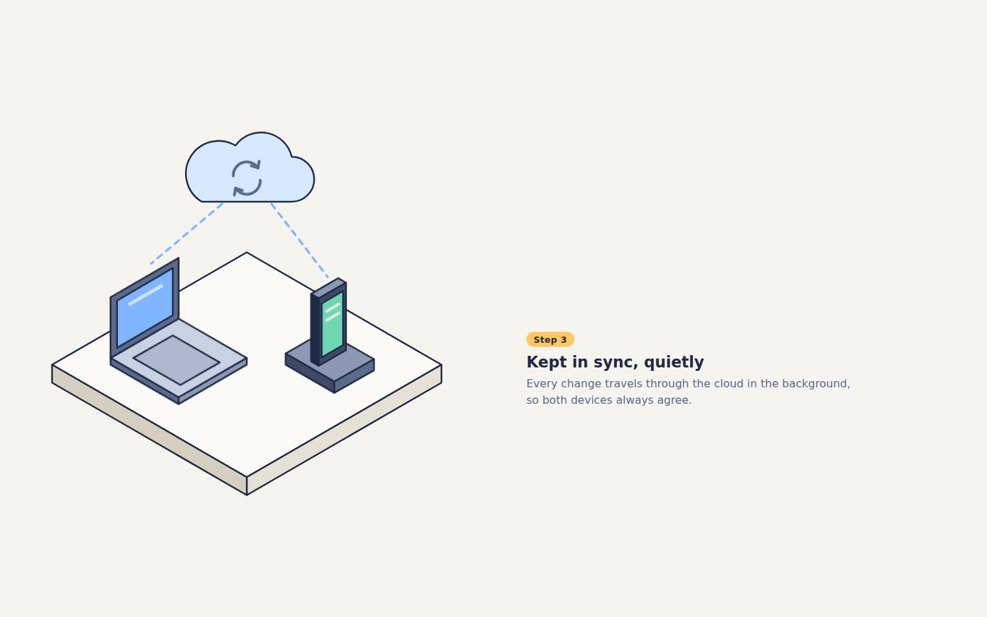
Lesson: For a sticky steps story, saying that the picture is a sibling of the steps and must reach their timelines through `timeline-scope` on the shared wrapper, plus one `view-timeline-name` per step and "one animation per layer, no fade-out", got a rebuild that builds up the same picture over the same entry ranges on the first try. Naming the phone layout in numbers (45cqh sticky picture, 55cqh intro, 80cqh steps with centred text) kept the steps readable under the picture; the platform's tray, shadow and side colours were left loose and drifted.
Facts
- Tags
- scroll story view timeline timeline scope position sticky isometric flat shaded harbor
- Weight
- 2.4 KB gzip (HTML + CSS)
- Needs
- No library, no JavaScript
- Browser support
- Scroll-driven animations with timeline-scope: Chrome and Edge 116+, Safari 26+; Firefox only behind a flag. position: sticky and CSS grid work in every current browser. Other browsers show the finished layout: the whole picture with all three layers and every step readable.
- Motion
- follows the scroll; without support or with reduced motion the finished layout shows
- Link
/examples/scroll-steps/
Source
Paste both parts into any page. Wrap the HTML in <div class="ma-scroll-steps"> and put the CSS in a <style> element or your stylesheet; every class, id and animation name starts with ma-scroll-steps, so it will not clash with your styles.
demo.html
<div class="ma-scroll-steps-story">
<div class="ma-scroll-steps-picture">
<svg class="ma-scroll-steps-art" viewBox="70 22 290 226" role="img" aria-labelledby="ma-scroll-steps-title">
<title id="ma-scroll-steps-title">An isometric platform where a laptop, then a phone, then a cloud linking them appear step by step</title>
<g stroke="#1F2A44" stroke-width="1.5" stroke-linejoin="round">
<g class="ma-scroll-steps-base">
<path d="M196 86L345 172L230.6 238L81.7 152Z" fill="#1F2A44" opacity=".08" stroke="none"/>
<path d="M334.6 172L230.6 232L230.6 222L334.6 162Z" fill="#C9D2E3"/>
<path d="M92.1 152L230.6 232L230.6 222L92.1 142Z" fill="#A3B0C8"/>
<path d="M196 82L334.6 162L230.6 222L92.1 142Z" fill="#F6F4EF"/>
<path d="M196 92L317.2 162L230.6 212L109.4 142Z" fill="#E6E9F0"/>
</g>
<g class="ma-scroll-steps-layer ma-scroll-steps-layer-1">
<path d="M241 134L206.4 154L206.4 151L241 131Z" fill="#B7C1D3"/>
<path d="M157.9 126L206.4 154L206.4 151L157.9 123Z" fill="#8F9BB3"/>
<path d="M192.5 103L241 131L206.4 151L157.9 123Z" fill="#E8ECF3"/>
<path d="M192.5 111L227.2 131L209.9 141L175.2 121Z" fill="#C9D2E3"/>
<path d="M243.6 129.5L241 131L241 93L243.6 91.5Z" fill="#B7C1D3"/>
<path d="M192.5 103L241 131L241 93L192.5 65Z" fill="#8F9BB3"/>
<path d="M195.1 63.5L243.6 91.5L241 93L192.5 65Z" fill="#E8ECF3"/>
<path d="M196 101L237.6 125L237.6 95L196 71Z" fill="#7FB6FF"/>
<path d="M202.9 83L227.2 97M202.9 90L220.2 100" stroke="#F6F4EF" stroke-width="3" stroke-linecap="round"/>
</g>
<g class="ma-scroll-steps-layer ma-scroll-steps-layer-2">
<path d="M279.1 174L263.5 183L263.5 178L279.1 169Z" fill="#5B6B8C"/>
<path d="M241 170L263.5 183L263.5 178L241 165Z" fill="#47567A"/>
<path d="M256.6 156L279.1 169L263.5 178L241 165Z" fill="#8F9BB3"/>
<path d="M270.5 170L267 172L267 138L270.5 136Z" fill="#B7C1D3"/>
<path d="M251.4 163L267 172L267 138L251.4 129Z" fill="#8F9BB3"/>
<path d="M254.9 127L270.5 136L267 138L251.4 129Z" fill="#E8ECF3"/>
<path d="M253.2 161L265.3 168L265.3 140L253.2 133Z" fill="#6FD6B4"/>
<path d="M255.8 142.5L262.7 146.5" stroke="#F6F4EF" stroke-width="2.5" stroke-linecap="round"/>
</g>
<g class="ma-scroll-steps-layer ma-scroll-steps-layer-3">
<path d="M230.6 86L231.4 56M261 129.5L273.4 56" fill="none" stroke="#7FB6FF" stroke-width="2" stroke-dasharray="4 6" stroke-linecap="round"/>
<path d="M217.4 52a14 14 0 0 1 4-26a18 18 0 0 1 32-8a14 14 0 0 1 26 10a12 12 0 0 1 -2 24Z" fill="#E8F2FF"/>
<path d="M243.4 42a9 9 0 0 1 15-5l3 3m0-7v7h-7M262.4 45a9 9 0 0 1 -15 5l-3 -3m0 7v-7h7" fill="none" stroke="#5B6B8C" stroke-width="2" stroke-linecap="round"/>
</g>
</g>
</svg>
</div>
<div class="ma-scroll-steps-list">
<header class="ma-scroll-steps-intro">
<h2>From desk to pocket in three steps</h2>
<p>Scroll on: each step adds its piece to the picture.</p>
</header>
<section class="ma-scroll-steps-step ma-scroll-steps-step-1">
<p class="ma-scroll-steps-num">Step 1</p>
<h3>Start on your laptop</h3>
<p>Draft the plan where you have room: routes, notes and bookings in one place.</p>
</section>
<section class="ma-scroll-steps-step ma-scroll-steps-step-2">
<p class="ma-scroll-steps-num">Step 2</p>
<h3>Pick it up on your phone</h3>
<p>The same plan opens on your phone, ready for the platform or the queue.</p>
</section>
<section class="ma-scroll-steps-step ma-scroll-steps-step-3">
<p class="ma-scroll-steps-num">Step 3</p>
<h3>Kept in sync, quietly</h3>
<p>Every change travels both ways through the cloud, so nothing is ever out of date.</p>
</section>
</div>
</div>
demo.css
/* Sticky steps: three text steps scroll past a sticky picture that builds up one layer per step.
   Each step names its own view timeline; timeline-scope on the shared wrapper lets the picture
   (a sibling, not a descendant) use those timelines. The base styles are the finished picture and
   readable steps, so without support, with reduced motion or paused, everything simply shows.
   Only transform and opacity move. */
.ma-scroll-steps {
  background: #F6F4EF;
  color: #1F2A44;
}

.ma-scroll-steps .ma-scroll-steps-picture {
  position: sticky;
  top: 0;
  z-index: 1;
  box-sizing: border-box;
  height: 45cqh;
  padding: 0.5rem 1rem;
  background: #F6F4EF;
  border-bottom: 1px solid #E6E9F0;
}

.ma-scroll-steps .ma-scroll-steps-art {
  display: block;
  width: 100%;
  height: 100%;
}

.ma-scroll-steps .ma-scroll-steps-intro,
.ma-scroll-steps .ma-scroll-steps-step {
  box-sizing: border-box;
  padding: 1.5rem 1.25rem;
}

.ma-scroll-steps .ma-scroll-steps-intro {
  display: flex;
  flex-direction: column;
  justify-content: center;
  min-height: 55cqh;
}

.ma-scroll-steps .ma-scroll-steps-step {
  display: flex;
  flex-direction: column;
  justify-content: center;
  align-items: flex-start;
  min-height: 80cqh;
}

.ma-scroll-steps h2,
.ma-scroll-steps h3 {
  overflow-wrap: break-word;
}

.ma-scroll-steps h2 {
  margin: 0 0 0.4rem;
  font-size: 1.35rem;
  line-height: 1.2;
}

.ma-scroll-steps h3 {
  margin: 0 0 0.4rem;
  font-size: 1.15rem;
  line-height: 1.25;
}

.ma-scroll-steps p {
  margin: 0;
  max-width: 28rem;
  font-size: 0.95rem;
  line-height: 1.5;
  color: #5B6B8C;
}

.ma-scroll-steps .ma-scroll-steps-num {
  display: inline-block;
  margin-bottom: 0.6rem;
  padding: 0.15rem 0.6rem;
  border-radius: 999px;
  background: #FFC861;
  color: #1F2A44;
  font-size: 0.8rem;
  font-weight: 700;
}

/* Two columns on wider screens: the sticky picture on the left, the steps on the right. */
@media (min-width: 768px) {
  .ma-scroll-steps .ma-scroll-steps-story {
    display: grid;
    grid-template-columns: minmax(0, 1.1fr) minmax(0, 1fr);
    align-items: start;
  }

  .ma-scroll-steps .ma-scroll-steps-picture {
    height: 100cqh;
    padding: 2rem;
    border-bottom: 0;
  }

  .ma-scroll-steps .ma-scroll-steps-intro {
    min-height: 100cqh;
    padding: 2rem 2.5rem;
  }

  .ma-scroll-steps .ma-scroll-steps-step {
    padding: 2rem 2.5rem;
  }

  .ma-scroll-steps h2 {
    font-size: 1.75rem;
  }
}

/* Each layer starts a little low and transparent, and settles into the picture. */
@keyframes ma-scroll-steps-rise {
  from {
    opacity: 0;
    transform: translateY(24px);
  }
  to {
    opacity: 1;
    transform: translateY(0);
  }
}

/* Animation wiring only. Each step names its view timeline, the wrapper shares the three names
   with timeline-scope, and layer n plays over the second half of step n's entry into view, while
   that step's text is on screen (one animation per layer, no fade-out). */
@supports (animation-timeline: view()) and (timeline-scope: none) {
  .ma-scroll-steps .ma-scroll-steps-story {
    timeline-scope: --ma-scroll-steps-1, --ma-scroll-steps-2, --ma-scroll-steps-3;
  }

  .ma-scroll-steps .ma-scroll-steps-step-1 {
    view-timeline-name: --ma-scroll-steps-1;
  }

  .ma-scroll-steps .ma-scroll-steps-step-2 {
    view-timeline-name: --ma-scroll-steps-2;
  }

  .ma-scroll-steps .ma-scroll-steps-step-3 {
    view-timeline-name: --ma-scroll-steps-3;
  }

  .ma-scroll-steps .ma-scroll-steps-layer {
    animation-timing-function: ease-out;
    animation-range: entry 40% entry 100%;
  }

  .ma-scroll-steps .ma-scroll-steps-layer-1 {
    animation-name: ma-scroll-steps-rise;
    animation-duration: auto;
    animation-fill-mode: both;
    animation-timeline: --ma-scroll-steps-1;
  }

  .ma-scroll-steps .ma-scroll-steps-layer-2 {
    animation-name: ma-scroll-steps-rise;
    animation-duration: auto;
    animation-fill-mode: both;
    animation-timeline: --ma-scroll-steps-2;
  }

  .ma-scroll-steps .ma-scroll-steps-layer-3 {
    animation-name: ma-scroll-steps-rise;
    animation-duration: auto;
    animation-fill-mode: both;
    animation-timeline: --ma-scroll-steps-3;
  }
}

/* Calm still frame: the finished picture with every layer. */
@media (prefers-reduced-motion: reduce) {
  .ma-scroll-steps,
  .ma-scroll-steps * {
    animation: none !important;
  }
}