All examples / scroll story
Parallax hero: landscape layers at three speeds
A hero band of flat-vector sky, far hills and near hills under a headline; as the band scrolls through the view the layers slide up at three different rates, so the scene gains depth. One named CSS view timeline, no script.
Prompt tested
Brindlecove · Weekend trails
Find the quiet side of the coast
Ferries, footpaths and a bed for the night, planned in one go.
Plan less, walk more
Pick a stretch of coast and a weekend. Brindlecove lines up the ferry times, the footpaths between them and a place to sleep at the end of each day.
Pack for the weather you get
A short forecast for every stop sits beside the route, so the rain jacket goes in the bag on the right morning.
Prompt
Build a parallax hero band for an invented trip planner called Brindlecove, driven by a CSS scroll-driven animation on the band's own named view timeline (view-timeline-name on the band, animation-timeline on each layer; no JavaScript, no scroll event listeners, no libraries), as one HTML fragment plus CSS scoped under one wrapper class. The band is position: relative, 120cqh tall (use cqh for heights, never vh) and clips its layers with overflow: clip (not hidden). Behind the text it stacks three absolutely positioned flat-vector layers, each 20% taller than the band so no gap can show, no outlines: (1) a sky layer with a vertical gradient from pale sky blue #C4DDFF through #EEF4FB to paper #F6F4EF, a round sun-yellow #FFC861 disc (about 4.5rem) to the right of centre and two white rounded cloud bars; (2) a far-hills layer: one inline SVG (viewBox 0 0 100 120, preserveAspectRatio none) with a gently rolling pale-blue (#A9CCF7) ridge around the middle of the band; (3) a near-hills layer: one inline SVG with a mint (#6FD6B4) ridge lower down and a darker mint (#4FB896) ridge in front of it at the bottom. Keep the hill layers at least 60rem wide, centred, so the hills keep their shape on a phone. On top, centred near the top of the band: a small uppercase slate (#5B6B8C) kicker 'Brindlecove · Weekend trails', a large ink (#1F2A44) sans-serif h2 'Find the quiet side of the coast' and one line of copy. After the band, on paper #F6F4EF, a text block at least 100cqh tall with two short h3 + paragraph pairs about planning a coast walk. Motion: over the band's whole cover range (animation-range: cover), linear, each layer slides up from its base position: sky translateY(0) to -4cqh, far hills 0 to -9cqh, near hills 0 to -15cqh, so the farthest layer moves least and nothing travels more than 15% of the frame; the headline stays put. Each animated rule sets animation-name, animation-duration: auto, animation-timing-function: linear, animation-fill-mode: both, animation-timeline and animation-range itself. The base styles are the finished picture; put only those animation lines and view-timeline-name inside @supports (animation-timeline: view()), so other browsers show the still scene, and add a prefers-reduced-motion rule with animation: none that shows the same still scene. No position: fixed and no overflow: hidden or auto.
Words it rests on
- parallax hero band
- CSS scroll-driven animation on a named view timeline (view-timeline-name on the band, animation-timeline on each layer)
- animation-range: cover
- depth by rate: far layer moves least (−4cqh, −9cqh, −15cqh)
- layers 20% taller than the band, so no gap shows
- overflow: clip (clips without making a scroll container)
- flat-vector landscape, no outlines
- animation-duration: auto + animation-fill-mode: both
- @supports (animation-timeline: view()) holding only the animation lines
- heights in cqh, not vh
- no scroll event listeners
Prompt test
A fresh AI session given only this prompt rebuilt this on 2026-11-05 using claude-opus-5-5; a separate fresh session using claude-opus-5-5 judged it “like this”.
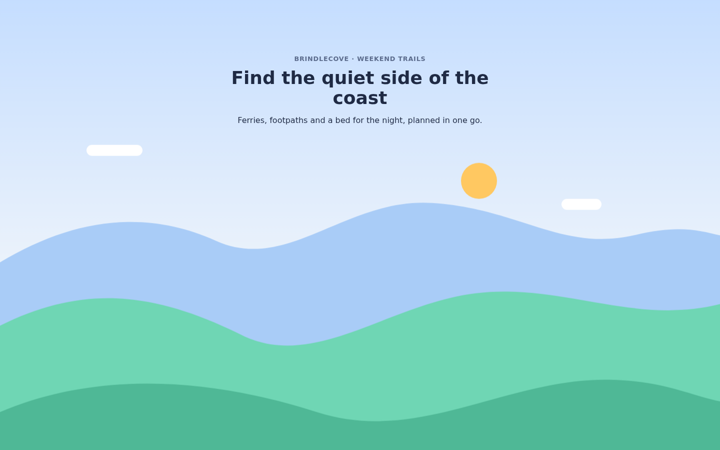
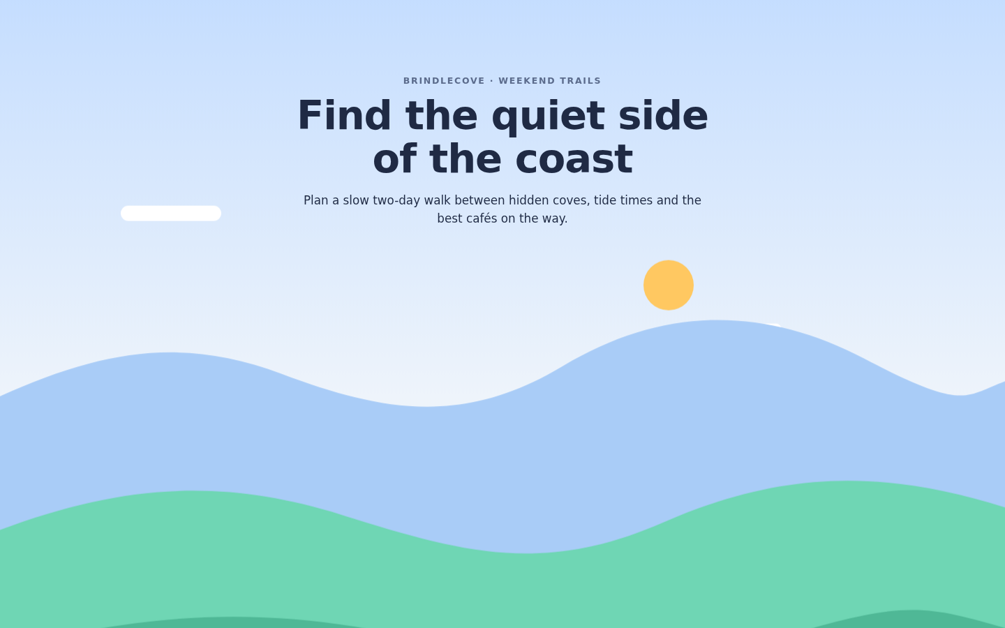
Lesson: For parallax, giving each layer its exact travel on one named view timeline (sky −4cqh, far −9cqh, near −15cqh over `animation-range: cover`), saying the layers are 20 % taller than a band that clips with `overflow: clip`, and asking for a minimum width on the hill layers got a rebuild with identical motion and no gaps at 390 or 1440 px, on the first try. Ridge heights and where the sun sits were given only roughly and drifted; give them as numbers when the skyline matters.
Facts
- Tags
- scroll story view timeline parallax flat vector harbor
- Weight
- 1.8 KB gzip (HTML + CSS)
- Needs
- No library, no JavaScript
- Browser support
- CSS scroll-driven animations (view-timeline, animation-range): Chrome and Edge 115+, Safari 26+; Firefox only behind a flag (MDN). Other browsers show the finished layout: the landscape at rest.
- Motion
- follows the scroll; without support or with reduced motion the finished layout shows
- Link
/examples/scroll-parallax/
Source
Paste both parts into any page. Wrap the HTML in <div class="ma-scroll-parallax"> and put the CSS in a <style> element or your stylesheet; every class, id and animation name starts with ma-scroll-parallax, so it will not clash with your styles.
demo.html
<div class="ma-scroll-parallax-story">
  <div class="ma-scroll-parallax-band">
    <div class="ma-scroll-parallax-layer ma-scroll-parallax-sky" aria-hidden="true">
      <span class="ma-scroll-parallax-sun"></span>
      <span class="ma-scroll-parallax-cloud ma-scroll-parallax-cloud-1"></span>
      <span class="ma-scroll-parallax-cloud ma-scroll-parallax-cloud-2"></span>
    </div>
    <svg class="ma-scroll-parallax-layer ma-scroll-parallax-far" viewBox="0 0 100 120" preserveAspectRatio="none" aria-hidden="true">
      <path d="M0 52 C10 44 20 42 30 48 C40 54 48 40 60 41 C72 42 78 50 88 47 C94 45 97 46 100 47 L100 120 L0 120 Z" fill="#A9CCF7"/>
    </svg>
    <svg class="ma-scroll-parallax-layer ma-scroll-parallax-near" viewBox="0 0 100 120" preserveAspectRatio="none" aria-hidden="true">
      <path d="M0 66 C12 58 22 60 34 68 C44 74 54 62 66 60 C78 58 88 66 100 62 L100 120 L0 120 Z" fill="#6FD6B4"/>
      <path d="M0 82 C14 74 30 76 44 82 C58 88 70 76 84 76 C92 76 96 79 100 80 L100 120 L0 120 Z" fill="#4FB896"/>
    </svg>
    <div class="ma-scroll-parallax-copy">
      <p class="ma-scroll-parallax-kicker">Brindlecove · Weekend trails</p>
      <h2>Find the quiet side of the coast</h2>
      <p>Ferries, footpaths and a bed for the night, planned in one go.</p>
    </div>
  </div>
  <div class="ma-scroll-parallax-after">
    <h3>Plan less, walk more</h3>
    <p>Pick a stretch of coast and a weekend. Brindlecove lines up the ferry times, the footpaths between them and a place to sleep at the end of each day.</p>
    <h3>Pack for the weather you get</h3>
    <p>A short forecast for every stop sits beside the route, so the rain jacket goes in the bag on the right morning.</p>
  </div>
</div>
demo.css
/* Parallax hero band: sky, far hills and near hills slide up at different rates while the band
   crosses the view, so the far layer moves least. All three run on the band's named view
   timeline over its cover range; travel is at most 15 % of the frame height. The layers are 20 %
   taller than the band and the band clips (overflow: clip, which adds no scroll container), so
   no gap ever shows. Without scroll timelines, with reduced motion or under pause the layers
   rest in their base positions: the finished picture. */
.ma-scroll-parallax .ma-scroll-parallax-story {
  background: #F6F4EF;
  color: #1F2A44;
  font-family: system-ui, -apple-system, 'Segoe UI', sans-serif;
}

.ma-scroll-parallax .ma-scroll-parallax-band {
  position: relative;
  height: 120cqh;
  overflow: clip;
  background: #DCEBFF;
}

.ma-scroll-parallax .ma-scroll-parallax-layer {
  position: absolute;
  top: 0;
  left: 0;
  display: block;
  width: 100%;
  height: 120%;
}

/* The hills keep their shape on a phone: at least 60rem wide, centred, clipped by the band. */
.ma-scroll-parallax .ma-scroll-parallax-far,
.ma-scroll-parallax .ma-scroll-parallax-near {
  left: calc(50% - max(50%, 30rem));
  width: max(100%, 60rem);
}

.ma-scroll-parallax .ma-scroll-parallax-sky {
  background: linear-gradient(#C4DDFF, #EEF4FB 45%, #F6F4EF 70%);
}

.ma-scroll-parallax .ma-scroll-parallax-sun {
  position: absolute;
  top: 38cqh;
  left: 64%;
  width: 4.5rem;
  height: 4.5rem;
  border-radius: 50%;
  background: #FFC861;
}

.ma-scroll-parallax .ma-scroll-parallax-cloud {
  position: absolute;
  height: 1.4rem;
  border-radius: 1rem;
  background: #FFFFFF;
}

.ma-scroll-parallax .ma-scroll-parallax-cloud-1 {
  top: 34cqh;
  left: 12%;
  width: 7rem;
}

.ma-scroll-parallax .ma-scroll-parallax-cloud-2 {
  top: 46cqh;
  left: 78%;
  width: 5rem;
}

.ma-scroll-parallax .ma-scroll-parallax-copy {
  position: relative;
  max-width: 34rem;
  margin: 0 auto;
  padding: 12cqh 1.25rem 0;
  text-align: center;
}

.ma-scroll-parallax .ma-scroll-parallax-kicker {
  margin: 0 0 0.5rem;
  font-size: 0.8rem;
  font-weight: 600;
  letter-spacing: 0.06em;
  text-transform: uppercase;
  color: #5B6B8C;
}

.ma-scroll-parallax h2 {
  margin: 0 0 0.75rem;
  font-size: 2.25rem;
  line-height: 1.1;
}

.ma-scroll-parallax p {
  margin: 0 0 1rem;
  line-height: 1.6;
}

.ma-scroll-parallax .ma-scroll-parallax-after {
  min-height: 100cqh;
  max-width: 36rem;
  margin: 0 auto;
  padding: 2.5rem 1.25rem;
  box-sizing: border-box;
}

.ma-scroll-parallax h3 {
  margin: 0 0 0.4rem;
  font-size: 1.25rem;
}

/* Base = translateY(0); each layer slides up by its own share of the frame. */
@keyframes ma-scroll-parallax-sky {
  from { transform: translateY(0); }
  to { transform: translateY(-4cqh); }
}

@keyframes ma-scroll-parallax-far {
  from { transform: translateY(0); }
  to { transform: translateY(-9cqh); }
}

@keyframes ma-scroll-parallax-near {
  from { transform: translateY(0); }
  to { transform: translateY(-15cqh); }
}

@supports (animation-timeline: view()) {
  .ma-scroll-parallax .ma-scroll-parallax-band {
    view-timeline-name: --ma-scroll-parallax-band;
  }

  .ma-scroll-parallax .ma-scroll-parallax-sky {
    animation-name: ma-scroll-parallax-sky;
    animation-duration: auto;
    animation-timing-function: linear;
    animation-fill-mode: both;
    animation-timeline: --ma-scroll-parallax-band;
    animation-range: cover;
  }

  .ma-scroll-parallax .ma-scroll-parallax-far {
    animation-name: ma-scroll-parallax-far;
    animation-duration: auto;
    animation-timing-function: linear;
    animation-fill-mode: both;
    animation-timeline: --ma-scroll-parallax-band;
    animation-range: cover;
  }

  .ma-scroll-parallax .ma-scroll-parallax-near {
    animation-name: ma-scroll-parallax-near;
    animation-duration: auto;
    animation-timing-function: linear;
    animation-fill-mode: both;
    animation-timeline: --ma-scroll-parallax-band;
    animation-range: cover;
  }
}

@media (prefers-reduced-motion: reduce) {
  .ma-scroll-parallax,
  .ma-scroll-parallax * {
    animation: none !important;
  }
}