All examples / feature card
Isometric routing: parcels on a curved route
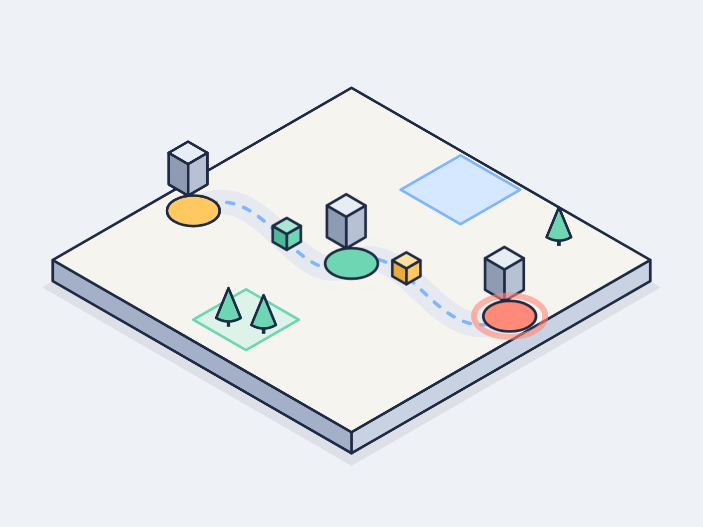
An isometric map tile with three hubs joined by one winding dashed road; small parcels ride the curve from hub to hub, two seconds apart, and each hub's pad ripples as a parcel goes by.
Prompt tested
Feature card size
Prompt
Draw a looping isometric illustration for a 'Routing' feature card in the Harbor palette, as one inline SVG animated with CSS keyframes and CSS offset-path (path following, no JavaScript, no libraries). Scene: a light paper-coloured isometric map tile (30° projection, a thin slab with a mid right edge and darker left edge) holding three hubs: a yellow oval pad at the upper left, a mint pad in the middle and a coral pad at the lower right, each with a small grey isometric tower standing just behind it. One wide pale road winds in a gentle S-curve from the yellow pad through the mint pad to the coral pad, with a dashed sky-blue centre line. Add a few small mint cone trees, a mint park square and a pale sky-blue lot for the map feel. Three small isometric cubes (mint, warm yellow, coral) ride the road from the first hub to the last, two seconds apart: put the same path as the drawn road in offset-path (in the SVG's own units), animate offset-distance from 0% to 100%, set offset-rotate: 0deg so the cubes stay upright, fade each cube in at the first hub and out at the last, and stagger them with negative animation-delay. Each pad's outline ring swells and fades once as a cube passes. Add an @supports not (offset-path: …) fallback that places the cubes on the road with transform and keeps them still. Use a navy outline (#1F2A44, 1.5 px, round joins) and the palette ink #1F2A44, slate #5B6B8C, sky #7FB6FF, mint #6FD6B4, sun #FFC861, coral #FF8A7A, paper #F6F4EF; shade each box with a light top, mid right face and darker left face. Loop every 6 seconds with no visible jump; animate only offset-distance, transform and opacity; add a prefers-reduced-motion rule that stops all animation and leaves a calm still frame with the three cubes spread along the road.
Words it rests on
- isometric illustration (30° projection)
- CSS offset-path: path() in SVG user units
- offset-distance keyframes
- offset-rotate: 0deg (keep movers upright)
- @supports not (offset-path) fallback
- staggered negative animation-delay
- seamless loop
- prefers-reduced-motion still frame
- feature card
Prompt test
A fresh AI session given only this prompt rebuilt this on 2026-11-04 using claude-opus-5-5; a separate fresh session using claude-opus-5-5 judged it “like this”.
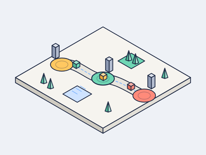
Lesson: Naming the mechanism in full — 'put the same path as the drawn road in offset-path (in the SVG's own units), animate offset-distance, offset-rotate: 0deg' — was enough for the rebuild to keep the cubes on its own road and upright, and it added the `@supports` fallback because the prompt asked for it. What the prompt did not pin down drifted: the hub rings' colour and timing (say 'in the hub's own colour, timed to the cube passing') and the road's shape ('wide pale S-shaped band').
Facts
- Tags
- feature card offset path css keyframes inline svg isometric flat shaded harbor
- Weight
- 1.7 KB gzip (SVG + CSS)
- Needs
- No library, no JavaScript
- Browser support
- CSS offset-path with path(): Chrome and Edge 79+ (path() since Chrome 64), Firefox 72+, Safari 16+ (MDN). Older browsers get the @supports fallback: the parcels rest on the route, still.
- Loop
- 6 s, seamless; still frame with reduced motion
- Link
/examples/iso-routing/
Source
Paste both parts into any page. Wrap the SVG in <div class="ma-iso-routing"> and put the CSS in a <style> element or your stylesheet; every class, id and animation name starts with ma-iso-routing, so it will not clash with your styles.
demo.svg
<svg xmlns="http://www.w3.org/2000/svg" viewBox="0 0 400 300" role="img" aria-labelledby="ma-iso-routing-title">
<title id="ma-iso-routing-title">An isometric map where three parcels follow one curved route past three hubs</title>
<g stroke="#1F2A44" stroke-width="1.5" stroke-linejoin="round">
<path d="M200 62L376 163.6L200 265.2L24 163.6Z" fill="#1F2A44" opacity=".08" stroke="none"/>
<path d="M370 148L200 246L200 258L370 160Z" fill="#C9D2E3"/>
<path d="M30 148L200 246L200 258L30 160Z" fill="#A3B0C8"/>
<path d="M200 50L370 148L200 246L30 148Z" fill="#F6F4EF"/>
<path d="M262 88.4L296 108L262 127.6L228 108Z" fill="#D6E8FF" stroke="#7FB6FF"/>
<path d="M140 164.7L170 182L140 199.3L110 182Z" fill="#DDF3EA" stroke="#6FD6B4"/>
<path d="M130 186v-6" stroke-width="2"/>
<path d="M130 164L137 181Q130 185 123 181Z" fill="#6FD6B4"/>
<path d="M150 190v-6" stroke-width="2"/>
<path d="M150 168L157 185Q150 189 143 185Z" fill="#6FD6B4"/>
<path d="M318 140v-6" stroke-width="2"/>
<path d="M318 118L325 135Q318 139 311 135Z" fill="#6FD6B4"/>
<path d="M110 120C150 96 168 168 200 150S250 204 290 180" fill="none" stroke="#E6E9F0" stroke-width="14" stroke-linecap="round"/>
<path d="M110 120C150 96 168 168 200 150S250 204 290 180" fill="none" stroke="#7FB6FF" stroke-width="2" stroke-dasharray="4 6" stroke-linecap="round"/>
<path d="M107 93.4L118 87L118 105L107 111.4Z" fill="#B7C1D3"/>
<path d="M96 87L107 93.4L107 111.4L96 105Z" fill="#8F9BB3"/>
<path d="M107 80.6L118 87L107 93.4L96 87Z" fill="#E8ECF3"/>
<ellipse cx="110" cy="120" rx="15" ry="8.7" fill="#FFC861"/>
<g class="ma-iso-routing-ring ma-iso-routing-ring-a" opacity="0"><ellipse cx="110" cy="120" rx="15" ry="8.7" fill="none" stroke="#FFC861" stroke-width="2.5"/></g>
<path d="M197 123.4L208 117L208 135L197 141.4Z" fill="#B7C1D3"/>
<path d="M186 117L197 123.4L197 141.4L186 135Z" fill="#8F9BB3"/>
<path d="M197 110.6L208 117L197 123.4L186 117Z" fill="#E8ECF3"/>
<ellipse cx="200" cy="150" rx="15" ry="8.7" fill="#6FD6B4"/>
<g class="ma-iso-routing-ring ma-iso-routing-ring-b" opacity="0"><ellipse cx="200" cy="150" rx="15" ry="8.7" fill="none" stroke="#6FD6B4" stroke-width="2.5"/></g>
<path d="M287 153.4L298 147L298 165L287 171.4Z" fill="#B7C1D3"/>
<path d="M276 147L287 153.4L287 171.4L276 165Z" fill="#8F9BB3"/>
<path d="M287 140.6L298 147L287 153.4L276 147Z" fill="#E8ECF3"/>
<ellipse cx="290" cy="180" rx="15" ry="8.7" fill="#FF8A7A"/>
<g class="ma-iso-routing-ring ma-iso-routing-ring-c" opacity="0"><ellipse cx="290" cy="180" rx="15" ry="8.7" fill="none" stroke="#FF8A7A" stroke-width="2.5"/></g>
<g class="ma-iso-routing-parcel ma-iso-routing-parcel-1">
<path d="M0 -4.4L8 -9L8 0L0 4.6Z" fill="#6FD6B4"/>
<path d="M-8 -9L0 -4.4L0 4.6L-8 0Z" fill="#4FB896"/>
<path d="M0 -13.6L8 -9L0 -4.4L-8 -9Z" fill="#A8E8D2"/>
</g>
<g class="ma-iso-routing-parcel ma-iso-routing-parcel-2">
<path d="M0 -4.4L8 -9L8 0L0 4.6Z" fill="#FFC861"/>
<path d="M-8 -9L0 -4.4L0 4.6L-8 0Z" fill="#E8AC3E"/>
<path d="M0 -13.6L8 -9L0 -4.4L-8 -9Z" fill="#FFE0A3"/>
</g>
<g class="ma-iso-routing-parcel ma-iso-routing-parcel-3">
<path d="M0 -4.4L8 -9L8 0L0 4.6Z" fill="#FF8A7A"/>
<path d="M-8 -9L0 -4.4L0 4.6L-8 0Z" fill="#E06A5B"/>
<path d="M0 -13.6L8 -9L0 -4.4L-8 -9Z" fill="#FFB8AD"/>
</g>
</g>
</svg>
demo.css
/* Isometric routing card: three parcels follow one curved route past three hubs.
   The parcels ride the route with CSS offset-path; the path is in the SVG's own units, so it
   scales with the drawing. Loop period 6 s; a parcel passes each hub every 2 s, and the
   negative delays make the first frame match the still frame. */
.ma-iso-routing svg {
  display: block;
  width: 100%;
  height: auto;
}

/* The same path as the drawn route; offset-rotate 0deg keeps the cubes upright. */
.ma-iso-routing .ma-iso-routing-parcel {
  offset-path: path('M110 120C150 96 168 168 200 150S250 204 290 180');
  offset-rotate: 0deg;
  animation-name: ma-iso-routing-travel;
  animation-duration: 6s;
  animation-timing-function: linear;
  animation-iteration-count: infinite;
}

.ma-iso-routing .ma-iso-routing-parcel-1 {
  offset-distance: 11.1%;
  animation-delay: -0.6s;
}

.ma-iso-routing .ma-iso-routing-parcel-2 {
  offset-distance: 48.1%;
  animation-delay: -2.6s;
}

.ma-iso-routing .ma-iso-routing-parcel-3 {
  offset-distance: 85.2%;
  animation-delay: -4.6s;
}

/* Fade in at the first hub, ride to the last, fade out, then slip back unseen. */
@keyframes ma-iso-routing-travel {
  0%, 100% { offset-distance: 0%; opacity: 0; }
  6% { opacity: 1; }
  84% { opacity: 1; }
  90% { offset-distance: 100%; opacity: 0; }
}

/* Each hub's ring swells once as a parcel passes over its pad. */
.ma-iso-routing .ma-iso-routing-ring {
  transform-box: fill-box;
  transform-origin: center;
  animation-name: ma-iso-routing-pulse;
  animation-duration: 2s;
  animation-timing-function: ease-out;
  animation-iteration-count: infinite;
}

.ma-iso-routing .ma-iso-routing-ring-a {
  animation-delay: -0.8s;
}

.ma-iso-routing .ma-iso-routing-ring-b {
  animation-delay: -0.1s;
}

.ma-iso-routing .ma-iso-routing-ring-c {
  animation-delay: -1.4s;
}

@keyframes ma-iso-routing-pulse {
  0%, 100% { transform: scale(1.15); opacity: 0; }
  10% { transform: scale(1.15); opacity: 0.9; }
  60% { transform: scale(1.8); opacity: 0; }
}

/* Browsers without offset-path: the parcels rest on the route, spread out, and stay still. */
@supports not (offset-path: path('M 0 0')) {
  .ma-iso-routing .ma-iso-routing-parcel {
    animation-name: none;
  }

  .ma-iso-routing .ma-iso-routing-parcel-1 {
    transform: translate(132px, 115.7px);
  }

  .ma-iso-routing .ma-iso-routing-parcel-2 {
    transform: translate(196.4px, 151.7px);
  }

  .ma-iso-routing .ma-iso-routing-parcel-3 {
    transform: translate(260.8px, 181.7px);
  }
}

/* Calm still frame: three parcels spread along the route, no rings. */
@media (prefers-reduced-motion: reduce) {
  .ma-iso-routing,
  .ma-iso-routing * {
    animation: none !important;
  }
}