All examples / feature card
Isometric notifications: tray, envelope and bell
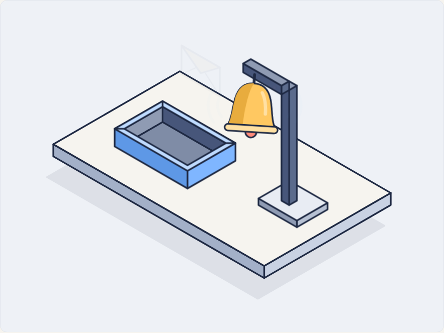
An open inbox tray and a bell hanging from a post stand on an isometric platform; an envelope rises out of the tray and floats away, then the bell gives one damped swing with ring lines and a small coral badge pops up beside it.
Prompt tested
Feature card size
Prompt
Draw a looping isometric illustration for a 'Notifications' feature card as one inline SVG with CSS keyframes only (no JavaScript, no libraries). Scene: a light paper-coloured isometric platform (30° projection). On the left, an open light-blue inbox tray (an isometric box with a visible inside and a thin rim). On the right, a slate post with an arm at the top, and a warm-yellow bell hanging from the end of the arm, with a small coral clapper under it. Motion, in order: a small paper envelope with a yellow flap rises out of the tray, drifts up towards the bell and fades; then the bell rings once — it swings from its hanging point in a few damped swings (about 9°, -7°, 4°, -2°, then still), light-blue curved ring lines appear on both sides, and a small coral badge circle pops in at the bell's top right (scale up with a slight overshoot), stays, and shrinks away before the next envelope. Use a navy outline (#1F2A44, 1.5 px, round joins) and the palette ink #1F2A44, slate #5B6B8C, sky #7FB6FF, mint #6FD6B4, sun #FFC861, coral #FF8A7A, paper #F6F4EF; shade each box with a light top, mid right face and darker left face. Rotate the bell around its hanging point (transform-origin there). Loop every 6 seconds with no visible jump; animate only transform and opacity; add a prefers-reduced-motion rule that stops all animation and leaves a calm still frame with the envelope half out of the tray, the bell at rest and the badge showing.
Prompt test
A fresh AI session given only the prompt above rebuilt this on 2026-11-03 using claude-opus-5-5; a separate fresh session using claude-opus-5-5 judged it “like this”.
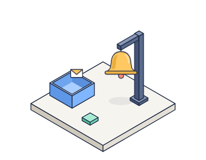
Lesson: Giving the motion as an ordered story (envelope rises and fades, then the bell rings), the swing as explicit damped angles (9°, -7°, 4°, -2°) and "rotate around its hanging point (transform-origin there)" produced a bell that swings from the right place first time; listing a palette colour the scene never uses (mint) made the rebuild invent a spare mint object, so name only the colours the scene needs or say where each goes.
Words it rests on
- isometric illustration (30° projection)
- inline SVG
- CSS @keyframes
- seamless loop
- damped swing (rotate around a transform-origin)
- pop-in with overshoot (scale)
- layered occlusion (object rising out of a box)
- three-tone face shading
- prefers-reduced-motion still frame
- feature card
Facts
- Tags
- feature card css keyframes inline svg isometric flat shaded harbor
- Weight
- 1.7 KB gzip (SVG + CSS)
- Needs
- No library, no JavaScript
- Browser support
- All current browsers (Chrome, Edge, Firefox, Safari 15+); CSS transforms with transform-box on SVG groups.
- Loop
- 6 s, seamless; still frame with reduced motion
- Link
/examples/iso-notifications/
Source
Paste both parts into any page. Wrap the SVG in <div class="ma-iso-notifications"> and put the CSS in a <style> element or your stylesheet; every class, id and animation name starts with ma-iso-notifications, so it will not clash with your styles.
demo.svg
<svg xmlns="http://www.w3.org/2000/svg" viewBox="0 0 400 300" role="img" aria-labelledby="ma-iso-notifications-title">
<title id="ma-iso-notifications-title">A bell on a stand sways as a small envelope rises out of an isometric tray</title>
<g stroke="#1F2A44" stroke-width="1.5" stroke-linejoin="round">
<path d="M156.3 93.7L346.8 203.7L232.5 269.7L42 159.7Z" fill="#1F2A44" opacity=".08"/>
<path d="M352.5 185L238.2 251L238.2 240L352.5 174Z" fill="#C9D2E3"/>
<path d="M47.7 141L238.2 251L238.2 240L47.7 130Z" fill="#A3B0C8"/>
<path d="M162 64L352.5 174L238.2 240L47.7 130Z" fill="#F6F4EF"/>
<path d="M146.4 91L212.2 129L168.9 154L103.1 116Z" fill="#5B6B8C"/>
<path d="M146.4 110L203.6 143L203.6 129L146.4 96Z" fill="#47567A"/>
<path d="M146.4 110L111.8 130L111.8 116L146.4 96Z" fill="#8F9BB3"/>
<path d="M146.4 110L203.6 143L168.9 163L111.8 130Z" fill="#7F8CA6"/>
<g class="ma-iso-notifications-envelope">
<path d="M137.8 124L172.4 144L172.4 118L137.8 98Z" fill="#F6F4EF"/>
<path d="M137.8 98L155.1 123.1L172.4 118Z" fill="#FFC861"/>
<path d="M137.8 124L150.9 118.1M172.4 144L159.2 122.9" fill="none" stroke-width="1"/>
</g>
<path d="M212.2 145L168.9 170L168.9 154L212.2 129Z" fill="#7FB6FF"/>
<path d="M103.1 132L168.9 170L168.9 154L103.1 116Z" fill="#5E98E6"/>
<path d="M107.4 113.5L168.9 149L207.9 126.5L212.2 129L168.9 154L103.1 116Z" fill="#BFDBFF"/>
<path d="M146.4 91L146.4 96L111.8 116L103.1 116Z" fill="#BFDBFF"/>
<path d="M146.4 91L212.2 129L203.6 129L146.4 96Z" fill="#BFDBFF"/>
<path d="M295.4 189L267.7 205L267.7 199L295.4 183Z" fill="#B7C1D3"/>
<path d="M233 185L267.7 205L267.7 199L233 179Z" fill="#8F9BB3"/>
<path d="M260.7 163L295.4 183L267.7 199L233 179Z" fill="#E8ECF3"/>
<path d="M267.7 181L260.7 185L260.7 81L267.7 77Z" fill="#5B6B8C"/>
<path d="M253.8 181L260.7 185L260.7 81L253.8 77Z" fill="#47567A"/>
<path d="M260.7 73L267.7 77L260.7 81L253.8 77Z" fill="#8F9BB3"/>
<path d="M260.7 81L253.8 85L253.8 77L260.7 73Z" fill="#5B6B8C"/>
<path d="M219.2 65L253.8 85L253.8 77L219.2 57Z" fill="#47567A"/>
<path d="M226.1 53L260.7 73L253.8 77L219.2 57Z" fill="#8F9BB3"/>
<g class="ma-iso-notifications-bell">
<path d="M229.5 67l0 8" stroke-width="2.5" stroke-linecap="round"/>
<circle cx="229.5" cy="119" r="5" fill="#FF8A7A"/>
<path d="M207.5 115C211.5 109 211.5 97 213.5 89C216.5 77 223.5 75 229.5 75C235.5 75 242.5 77 245.5 89C247.5 97 247.5 109 251.5 115Z" fill="#FFC861"/>
<path d="M207.5 115C211.5 109 211.5 97 213.5 89C216.5 77 223.5 75 229.5 75C225.5 81 222.5 97 221.5 115Z" fill="#E8AC3E" stroke="none"/>
<path d="M237.5 83C240.5 88 241.5 95 241.5 102" fill="none" stroke="#FFE0A3" stroke-width="3" stroke-linecap="round"/>
<rect x="205.5" y="113" width="48" height="6" rx="3" fill="#FFE0A3"/>
</g>
<g class="ma-iso-notifications-ring" opacity="0">
<path d="M259.5 85q7 10 0 20M266.5 80q10 15 0 30" fill="none" stroke="#7FB6FF" stroke-width="2.5" stroke-linecap="round"/>
<path d="M199.5 85q-7 10 0 20M192.5 80q-10 15 0 30" fill="none" stroke="#7FB6FF" stroke-width="2.5" stroke-linecap="round"/>
</g>
<g class="ma-iso-notifications-badge">
<circle cx="247.5" cy="79" r="8" fill="#FF8A7A"/>
<path d="M247.5 75.5l0 7" stroke="#F6F4EF" stroke-width="2" stroke-linecap="round"/>
</g>
</g>
</svg>
demo.css
/* Isometric notifications card: an envelope rises out of the tray, then the bell rings and a badge pops.
   Loop period 6 s. Only transform and opacity animate. */
.ma-iso-notifications svg {
  display: block;
  width: 100%;
  height: auto;
}

.ma-iso-notifications .ma-iso-notifications-envelope,
.ma-iso-notifications .ma-iso-notifications-bell,
.ma-iso-notifications .ma-iso-notifications-ring,
.ma-iso-notifications .ma-iso-notifications-badge {
  animation-duration: 6s;
  animation-timing-function: ease-in-out;
  animation-iteration-count: infinite;
  animation-delay: -1.2s;
}

.ma-iso-notifications .ma-iso-notifications-envelope { animation-name: ma-iso-notifications-rise; }
.ma-iso-notifications .ma-iso-notifications-ring { animation-name: ma-iso-notifications-ring; }

/* The bell swings from the point where it hangs; the badge grows from its own centre. */
.ma-iso-notifications .ma-iso-notifications-bell {
  animation-name: ma-iso-notifications-sway;
  transform-box: view-box;
  transform-origin: 229.5px 67px;
}

.ma-iso-notifications .ma-iso-notifications-badge {
  animation-name: ma-iso-notifications-badge;
  transform-box: view-box;
  transform-origin: 247.5px 79px;
}

/* The envelope comes up out of the tray, floats towards the bell and fades. */
@keyframes ma-iso-notifications-rise {
  0%, 100% { transform: translate(0px, 22px); opacity: 0; }
  10% { transform: translate(0px, 14px); opacity: 1; }
  38% { transform: translate(18px, -40px); opacity: 1; }
  48% { transform: translate(26px, -58px); opacity: 0; }
}

/* One gentle ring: a few damped swings, then still. */
@keyframes ma-iso-notifications-sway {
  0%, 100% { transform: rotate(0deg); }
  44% { transform: rotate(0deg); }
  50% { transform: rotate(9deg); }
  56% { transform: rotate(-7deg); }
  62% { transform: rotate(4deg); }
  68% { transform: rotate(-2deg); }
  74% { transform: rotate(0deg); }
}

@keyframes ma-iso-notifications-ring {
  0%, 100% { opacity: 0; }
  46% { opacity: 0; }
  52% { opacity: 0.9; }
  72% { opacity: 0; }
}

/* The badge pops in as the bell rings and clears before the next envelope. */
@keyframes ma-iso-notifications-badge {
  0%, 100% { transform: scale(0.2); opacity: 0; }
  46% { transform: scale(0.2); opacity: 0; }
  52% { transform: scale(1.15); opacity: 1; }
  57% { transform: scale(1); opacity: 1; }
  90% { transform: scale(1); opacity: 1; }
  96% { transform: scale(0.2); opacity: 0; }
}

/* Calm still frame: the envelope half out of the tray, the badge showing, the bell at rest. */
@media (prefers-reduced-motion: reduce) {
  .ma-iso-notifications,
  .ma-iso-notifications * {
    animation: none !important;
  }
}