All examples / feature card
Isometric integrations: four apps feeding one hub
Four small app tiles in sky, mint, sun and coral are cabled to a central hub on a soft isometric platform. In turn, one every two seconds, a block in the app's colour runs along its lit cable into the hub, which brightens and sends out a ring as it arrives.
Prompt tested
Feature card size
Prompt
Draw a looping isometric illustration for an 'Integrations' feature card as one inline SVG with CSS keyframes only (no JavaScript, no libraries). Scene: a wide, light paper-coloured isometric platform (30° projection) with a visible edge thickness and a soft shadow. In the centre stands a low light grey hub box whose top face carries an inset sky-blue panel with a small white plus-shaped node and a white dot in the middle. Four smaller app boxes sit around it, one along each isometric axis of the platform: a sky-blue one with three short white lines on its top (up-left), a mint one with a white check mark (up-right), a warm yellow one with a white ring (down-right) and a coral one with a small white square outline (down-left). Each app is joined to the hub by a straight grey cable lying flat on the platform along that isometric axis. Motion: the apps take turns going round, one every 2 seconds: the app's cable lights up in its colour, a small cube in the same colour fades in at the app, slides along the cable into the hub and fades away, and as it arrives the hub's top briefly brightens and a thin sky-blue ring opens from the hub's top and fades. Use a navy outline (#1F2A44, 1.5 px, round joins) and the palette ink #1F2A44, slate #5B6B8C, sky #7FB6FF, mint #6FD6B4, sun #FFC861, coral #FF8A7A, paper #F6F4EF; shade each box with a light top, mid right face and darker left face. Loop every 8 seconds with no visible jump; animate only transform and opacity; add a prefers-reduced-motion rule that stops all animation and leaves a calm still frame with the sky-blue app's cable lit and its cube halfway to the hub.
Prompt test
A fresh AI session given only the prompt above rebuilt this on 2026-11-03 using claude-opus-5-5; a separate fresh session using claude-opus-5-5 judged it “like this”.
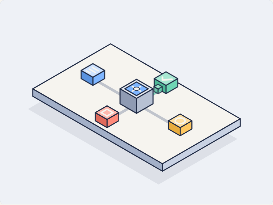
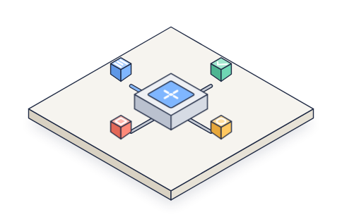
Lesson: Naming the round-robin as a rule ("the apps take turns going round, one every 2 seconds") and listing the steps of one turn in order (cable lights, cube fades in, slides along the cable, hub brightens and a ring opens as it arrives) reproduced the timing on the first try. Giving each app a colour plus a direction on screen ("up-left", "down-right") put every tile in the right place. Proportions were the weak spot: "low hub" and "smaller app boxes" left sizes and the platform's shape to chance, so state rough ratios when they matter.
Words it rests on
- isometric illustration (30° projection)
- inline SVG
- CSS @keyframes
- seamless loop
- staggered animation-delay (round-robin turns)
- hub and spoke layout
- glowing connector cable (opacity pulse)
- arrival ring (scale and fade from transform-origin: center)
- three-tone face shading
- prefers-reduced-motion still frame
- feature card
Facts
- Tags
- feature card css keyframes inline svg isometric flat shaded harbor
- Weight
- 2.1 KB gzip (SVG + CSS)
- Needs
- No library, no JavaScript
- Browser support
- All current browsers (Chrome, Edge, Firefox, Safari 15+); CSS transforms on SVG elements with transform-box: fill-box.
- Loop
- 8 s, seamless; still frame with reduced motion
- Link
/examples/iso-integrations/
Source
Paste both parts into any page. Wrap the SVG in <div class="ma-iso-integrations"> and put the CSS in a <style> element or your stylesheet; every class, id and animation name starts with ma-iso-integrations, so it will not clash with your styles.
demo.svg
<svg xmlns="http://www.w3.org/2000/svg" viewBox="0 0 400 300" role="img" aria-labelledby="ma-iso-integrations-title">
<title id="ma-iso-integrations-title">Four small app tiles linked by cables to a central hub on an isometric platform; a coloured block travels from each app to the hub in turn and the hub lights up as it arrives</title>
<g stroke="#1F2A44" stroke-width="1.5" stroke-linejoin="round">
<path d="M156.3 93.7L346.8 203.7L232.5 269.7L42 159.7Z" fill="#1F2A44" opacity=".08"/>
<path d="M352.5 185L238.2 251L238.2 240L352.5 174Z" fill="#C9D2E3"/>
<path d="M47.7 141L238.2 251L238.2 240L47.7 130Z" fill="#A3B0C8"/>
<path d="M162 64L352.5 174L238.2 240L47.7 130Z" fill="#F6F4EF"/>
<path d="M144.7 120L188 145" fill="none" stroke="#5B6B8C" stroke-width="4" stroke-linecap="round" opacity=".35"/>
<path d="M234.7 132L212.2 145" fill="none" stroke="#5B6B8C" stroke-width="4" stroke-linecap="round" opacity=".35"/>
<path d="M255.5 184L212.2 159" fill="none" stroke="#5B6B8C" stroke-width="4" stroke-linecap="round" opacity=".35"/>
<path d="M165.5 172L188 159" fill="none" stroke="#5B6B8C" stroke-width="4" stroke-linecap="round" opacity=".35"/>
<path class="ma-iso-integrations-lit ma-iso-integrations-lit-a" d="M144.7 120L188 145" fill="none" stroke="#7FB6FF" stroke-width="3" stroke-linecap="round" opacity=".9"/>
<path class="ma-iso-integrations-lit ma-iso-integrations-lit-b" d="M234.7 132L212.2 145" fill="none" stroke="#6FD6B4" stroke-width="3" stroke-linecap="round" opacity="0"/>
<path class="ma-iso-integrations-lit ma-iso-integrations-lit-c" d="M255.5 184L212.2 159" fill="none" stroke="#FFC861" stroke-width="3" stroke-linecap="round" opacity="0"/>
<path class="ma-iso-integrations-lit ma-iso-integrations-lit-d" d="M165.5 172L188 159" fill="none" stroke="#FF8A7A" stroke-width="3" stroke-linecap="round" opacity="0"/>
<g>
<path d="M260.7 127L243.4 137L243.4 125L260.7 115Z" fill="#6FD6B4"/>
<path d="M226.1 127L243.4 137L243.4 125L226.1 115Z" fill="#4FB896"/>
<path d="M243.4 105L260.7 115L243.4 125L226.1 115Z" fill="#A8E8D2"/>
<path d="M238.2 113L238.2 117L252.1 116" fill="none" stroke="#F6F4EF" stroke-width="2.6" stroke-linecap="round" stroke-linejoin="round"/>
</g>
<g>
<path d="M153.3 115L136 125L136 113L153.3 103Z" fill="#7FB6FF"/>
<path d="M118.7 115L136 125L136 113L118.7 103Z" fill="#5A93E0"/>
<path d="M136 93L153.3 103L136 113L118.7 103Z" fill="#CFE3FF"/>
<path d="M135.2 98.5L143.8 103.5" fill="none" stroke="#F6F4EF" stroke-width="2.2" stroke-linecap="round" stroke-linejoin="round"/>
<path d="M130.8 101L139.5 106" fill="none" stroke="#F6F4EF" stroke-width="2.2" stroke-linecap="round" stroke-linejoin="round"/>
<path d="M126.5 103.5L131.7 106.5" fill="none" stroke="#F6F4EF" stroke-width="2.2" stroke-linecap="round" stroke-linejoin="round"/>
</g>
<g class="ma-iso-integrations-pulse ma-iso-integrations-pulse-a" transform="translate(18.6 10.8)">
<path d="M153.8 121.8L147.7 125.3L147.7 118.3L153.8 114.8Z" fill="#7FB6FF"/>
<path d="M141.6 121.8L147.7 125.3L147.7 118.3L141.6 114.8Z" fill="#5A93E0"/>
<path d="M147.7 111.3L153.8 114.8L147.7 118.3L141.6 114.8Z" fill="#CFE3FF"/>
</g>
<g class="ma-iso-integrations-pulse ma-iso-integrations-pulse-b" transform="translate(0 0)" opacity="0">
<path d="M237.8 133.8L231.7 137.3L231.7 130.3L237.8 126.8Z" fill="#6FD6B4"/>
<path d="M225.7 133.8L231.7 137.3L231.7 130.3L225.7 126.8Z" fill="#4FB896"/>
<path d="M231.7 123.3L237.8 126.8L231.7 130.3L225.7 126.8Z" fill="#A8E8D2"/>
</g>
<g>
<path d="M224.4 152L200.1 166L200.1 144L224.4 130Z" fill="#B7C1D3"/>
<path d="M175.9 152L200.1 166L200.1 144L175.9 130Z" fill="#8F9BB3"/>
<path d="M200.1 116L224.4 130L200.1 144L175.9 130Z" fill="#E8ECF3"/>
<path d="M200.1 120L217.4 130L200.1 140L182.8 130Z" fill="#7FB6FF"/>
<path d="M194 126.5L206.2 133.5" fill="none" stroke="#F6F4EF" stroke-width="2.2" stroke-linecap="round" stroke-linejoin="round"/>
<path d="M206.2 126.5L194 133.5" fill="none" stroke="#F6F4EF" stroke-width="2.2" stroke-linecap="round" stroke-linejoin="round"/>
<ellipse cx="200.1" cy="130" rx="4.4" ry="2.5" fill="#F6F4EF" stroke-width="1"/>
<path class="ma-iso-integrations-glow" d="M200.1 116L224.4 130L200.1 144L175.9 130Z" fill="#F6F4EF" stroke="none" opacity="0"/>
<ellipse class="ma-iso-integrations-ring" cx="200.1" cy="130" rx="14.7" ry="8.5" fill="none" stroke="#7FB6FF" stroke-width="2" opacity="0"/>
</g>
<g class="ma-iso-integrations-pulse ma-iso-integrations-pulse-c" transform="translate(0 0)" opacity="0">
<path d="M258.6 182.3L252.5 185.8L252.5 178.8L258.6 175.3Z" fill="#FFC861"/>
<path d="M246.4 182.3L252.5 185.8L252.5 178.8L246.4 175.3Z" fill="#E8AC3E"/>
<path d="M252.5 171.8L258.6 175.3L252.5 178.8L246.4 175.3Z" fill="#FFE0A3"/>
</g>
<g class="ma-iso-integrations-pulse ma-iso-integrations-pulse-d" transform="translate(0 0)" opacity="0">
<path d="M174.6 170.3L168.5 173.8L168.5 166.8L174.6 163.3Z" fill="#FF8A7A"/>
<path d="M162.4 170.3L168.5 173.8L168.5 166.8L162.4 163.3Z" fill="#E06A5B"/>
<path d="M168.5 159.8L174.6 163.3L168.5 166.8L162.4 163.3Z" fill="#FFB8AD"/>
</g>
<g>
<path d="M174.1 177L156.8 187L156.8 175L174.1 165Z" fill="#FF8A7A"/>
<path d="M139.5 177L156.8 187L156.8 175L139.5 165Z" fill="#E06A5B"/>
<path d="M156.8 155L174.1 165L156.8 175L139.5 165Z" fill="#FFB8AD"/>
<path d="M156.8 160L165.5 165L156.8 170L148.1 165Z" fill="none" stroke="#F6F4EF" stroke-width="2.2"/>
</g>
<g>
<path d="M281.5 189L264.2 199L264.2 187L281.5 177Z" fill="#FFC861"/>
<path d="M246.9 189L264.2 199L264.2 187L246.9 177Z" fill="#E8AC3E"/>
<path d="M264.2 167L281.5 177L264.2 187L246.9 177Z" fill="#FFE0A3"/>
<ellipse cx="264.2" cy="177" rx="7.3" ry="4.2" fill="none" stroke="#F6F4EF" stroke-width="2.2"/>
</g>
</g>
</svg>
demo.css
/* Isometric integrations card: four app tiles are cabled to one hub. In turn, every 2 s, a block
   in the app's colour runs along its lit cable into the hub, and the hub flashes softly and
   sends out a ring as it arrives. Loop period 8 s. The negative delays make the first frame
   match the still frame in the markup. Only transform and opacity animate. */
.ma-iso-integrations svg {
  display: block;
  width: 100%;
  height: auto;
}

.ma-iso-integrations .ma-iso-integrations-pulse,
.ma-iso-integrations .ma-iso-integrations-lit {
  animation-duration: 8s;
  animation-iteration-count: infinite;
  animation-timing-function: linear;
}

.ma-iso-integrations .ma-iso-integrations-pulse-a { animation-name: ma-iso-integrations-pulse-a; }
.ma-iso-integrations .ma-iso-integrations-pulse-b { animation-name: ma-iso-integrations-pulse-b; }
.ma-iso-integrations .ma-iso-integrations-pulse-c { animation-name: ma-iso-integrations-pulse-c; }
.ma-iso-integrations .ma-iso-integrations-pulse-d { animation-name: ma-iso-integrations-pulse-d; }
.ma-iso-integrations .ma-iso-integrations-lit { animation-name: ma-iso-integrations-lit; }

/* The apps take turns, one every 2 s, going round the hub. */
.ma-iso-integrations .ma-iso-integrations-pulse-a,
.ma-iso-integrations .ma-iso-integrations-lit-a { animation-delay: -0.96s; }
.ma-iso-integrations .ma-iso-integrations-pulse-b,
.ma-iso-integrations .ma-iso-integrations-lit-b { animation-delay: -6.96s; }
.ma-iso-integrations .ma-iso-integrations-pulse-c,
.ma-iso-integrations .ma-iso-integrations-lit-c { animation-delay: -4.96s; }
.ma-iso-integrations .ma-iso-integrations-pulse-d,
.ma-iso-integrations .ma-iso-integrations-lit-d { animation-delay: -2.96s; }

/* Fade in at the app, run along the cable to the hub, and sink in. */
@keyframes ma-iso-integrations-pulse-a {
  0%, 100% { transform: translate(0px, 0px); opacity: 0; }
  4% { transform: translate(0px, 0px); opacity: 1; }
  20% { transform: translate(37.2px, 21.5px); opacity: 1; }
  24% { transform: translate(37.2px, 21.5px); opacity: 0; }
}

@keyframes ma-iso-integrations-pulse-b {
  0%, 100% { transform: translate(0px, 0px); opacity: 0; }
  4% { transform: translate(0px, 0px); opacity: 1; }
  20% { transform: translate(-16.5px, 9.5px); opacity: 1; }
  24% { transform: translate(-16.5px, 9.5px); opacity: 0; }
}

@keyframes ma-iso-integrations-pulse-c {
  0%, 100% { transform: translate(0px, 0px); opacity: 0; }
  4% { transform: translate(0px, 0px); opacity: 1; }
  20% { transform: translate(-37.2px, -21.5px); opacity: 1; }
  24% { transform: translate(-37.2px, -21.5px); opacity: 0; }
}

@keyframes ma-iso-integrations-pulse-d {
  0%, 100% { transform: translate(0px, 0px); opacity: 0; }
  4% { transform: translate(0px, 0px); opacity: 1; }
  20% { transform: translate(16.5px, -9.5px); opacity: 1; }
  24% { transform: translate(16.5px, -9.5px); opacity: 0; }
}

/* The cable lights in the app's colour while its block is on the way. */
@keyframes ma-iso-integrations-lit {
  0%, 100% { opacity: 0; }
  4%, 21% { opacity: 0.9; }
  28% { opacity: 0; }
}

/* The hub top brightens and a ring opens each time a block arrives (every 2 s). */
.ma-iso-integrations .ma-iso-integrations-glow,
.ma-iso-integrations .ma-iso-integrations-ring {
  animation-duration: 2s;
  animation-iteration-count: infinite;
  animation-timing-function: ease-out;
  animation-delay: -0.96s;
}

.ma-iso-integrations .ma-iso-integrations-glow { animation-name: ma-iso-integrations-glow; }

@keyframes ma-iso-integrations-glow {
  0%, 76%, 100% { opacity: 0; }
  84% { opacity: 0.45; }
}

.ma-iso-integrations .ma-iso-integrations-ring {
  animation-name: ma-iso-integrations-ring;
  transform-box: fill-box;
  transform-origin: center;
}

@keyframes ma-iso-integrations-ring {
  0%, 78%, 100% { transform: scale(0.5); opacity: 0; }
  82% { transform: scale(0.8); opacity: 0.9; }
  98% { transform: scale(1.6); opacity: 0; }
}

/* Calm still frame: the sky app's block halfway along its lit cable to the hub. */
@media (prefers-reduced-motion: reduce) {
  .ma-iso-integrations,
  .ma-iso-integrations * {
    animation: none !important;
  }
}