All examples / feature card
Dusk deploy: build block to server rack
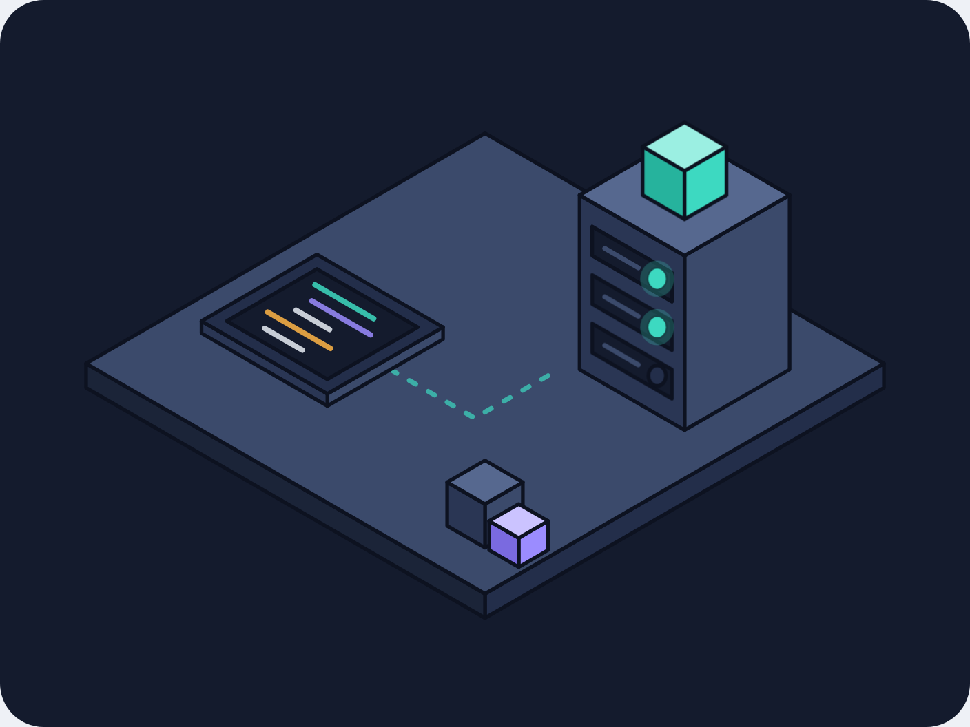
A dark isometric deploy scene: a teal build block lifts off a glowing code panel, arcs over and settles on top of a server rack, then the rack's three status lights turn teal one after another.
Prompt tested
Feature card size
Prompt
Draw a looping isometric illustration for a 'Deploy' feature card in a dark 'Dusk' palette (night mode, for a developer tool), as one inline SVG with CSS keyframes only (no JavaScript, no libraries). Draw the card background first: a rounded rectangle in night #141B2D filling the whole viewBox. On it, a square steel-blue isometric platform (30° projection, a thin slab). At the front left, a low code panel lying flat on the floor: a deep-blue console with a night-coloured screen showing five short code lines in teal, violet, mist and amber. At the back right, a tall server rack box with three dark slots on its front-left face, each with a short steel bar and a small round status light at its right end. A dashed teal pipeline runs along the floor from the panel to the rack, and two small crates (steel and violet) sit in the front right corner. The motion, every 6 seconds: a teal cube fades in on the code panel, lifts straight up, arcs over and settles on top of the rack (ease-in-out); then the three status lights turn teal one after another, top to bottom, each with a faint teal halo; near the end of the loop the cube fades out and the lights go dark together, ready for the next build. Each part fades in and out at most once per loop (no flashing). Use a very dark outline (#0D1220, 1.5 px, round joins) and the Dusk palette night #141B2D, deep #232E4A, steel #3B4A6B, mist #E6ECF5, teal #3DD9C1, violet #9B8CFF, amber #FFB547; shade each box with a lighter top, mid right face and darker left face. Loop with no visible jump; animate only transform and opacity; add a prefers-reduced-motion rule that stops all animation and leaves a calm still frame with the cube on the rack and all three lights teal.
Words it rests on
- dark palette (Dusk): night background, steel faces, teal accent
- isometric illustration (30° projection)
- card background drawn as the first SVG shape
- sequenced keyframes (one element after another)
- arc motion with ease-in-out
- one fade in and out per loop (no flashing)
- inline SVG
- CSS @keyframes
- prefers-reduced-motion still frame
- feature card
Prompt test
A fresh AI session given only this prompt rebuilt this on 2026-11-04 using claude-opus-5-5; a separate fresh session using claude-opus-5-5 judged it “like this”.
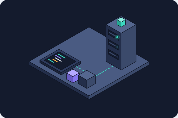
Lesson: A sequence (cube lands, then three lights in turn, then all reset) came back in the right order because the prompt told it as a story with 'then' and named the reset ('the lights go dark together, ready for the next build'). Saying 'each part fades in and out at most once per loop' was enough to keep the lights from blinking. Placement words ('front right corner') were followed loosely; give the relative sizes (cube about a third of the rack's width) if proportions matter.
Facts
- Tags
- feature card css keyframes inline svg isometric flat shaded dusk
- Weight
- 1.6 KB gzip (SVG + CSS)
- Needs
- No library, no JavaScript
- Browser support
- All current browsers (Chrome, Edge, Firefox, Safari 15+); CSS transforms on SVG groups.
- Loop
- 6 s, seamless; still frame with reduced motion
- Link
/examples/iso-dusk-deploy/
Source
Paste both parts into any page. Wrap the SVG in <div class="ma-iso-dusk-deploy"> and put the CSS in a <style> element or your stylesheet; every class, id and animation name starts with ma-iso-dusk-deploy, so it will not clash with your styles.
demo.svg
<svg xmlns="http://www.w3.org/2000/svg" viewBox="0 0 400 300" role="img" aria-labelledby="ma-iso-dusk-deploy-title">
<title id="ma-iso-dusk-deploy-title">A dark isometric scene where a build block rises from a code panel onto a server rack and three status lights turn teal in turn</title>
<rect width="400" height="300" rx="18" fill="#141B2D"/>
<g stroke="#0D1220" stroke-width="1.5" stroke-linejoin="round">
<path d="M364.5 160L200 255L200 245L364.5 150Z" fill="#232E4A"/>
<path d="M35.5 160L200 255L200 245L35.5 150Z" fill="#1B2438"/>
<path d="M200 55L364.5 150L200 245L35.5 150Z" fill="#3B4A6B"/>
<path d="M161 152.5L195.7 172.5L226 155" fill="none" stroke="#3DD9C1" stroke-width="2" stroke-dasharray="3 6" stroke-linecap="round" opacity=".7"/>
<path d="M215.6 217L200 226L200 208L215.6 199Z" fill="#3B4A6B"/>
<path d="M184.4 217L200 226L200 208L184.4 199Z" fill="#2A3654"/>
<path d="M200 190L215.6 199L200 208L184.4 199Z" fill="#56688F"/>
<path d="M226 227L213.9 234L213.9 222L226 215Z" fill="#9B8CFF"/>
<path d="M201.7 227L213.9 234L213.9 222L201.7 215Z" fill="#7A6AE0"/>
<path d="M213.9 208L226 215L213.9 222L201.7 215Z" fill="#CBC3FF"/>
<path d="M182.7 140L135 167.5L135 162.5L182.7 135Z" fill="#3B4A6B"/>
<path d="M83.1 137.5L135 167.5L135 162.5L83.1 132.5Z" fill="#2A3654"/>
<path d="M130.7 105L182.7 135L135 162.5L83.1 132.5Z" fill="#232E4A"/>
<path d="M130.7 111L172.3 135L135 156.5L93.5 132.5Z" fill="#141B2D"/>
<path d="M129.9 117.5L154.1 131.5" fill="none" stroke="#3DD9C1" stroke-width="2.2" stroke-linecap="round" opacity=".85"/>
<path d="M128.6 124.2L152.8 138.2" fill="none" stroke="#9B8CFF" stroke-width="2.2" stroke-linecap="round" opacity=".85"/>
<path d="M122.1 128L135.9 136" fill="none" stroke="#E6ECF5" stroke-width="2.2" stroke-linecap="round" opacity=".85"/>
<path d="M110.4 128.8L136.3 143.8" fill="none" stroke="#FFB547" stroke-width="2.2" stroke-linecap="round" opacity=".85"/>
<path d="M109.1 135.5L124.7 144.5" fill="none" stroke="#E6ECF5" stroke-width="2.2" stroke-linecap="round" opacity=".85"/>
<path d="M325.6 152.5L282.3 177.5L282.3 105.5L325.6 80.5Z" fill="#3B4A6B"/>
<path d="M239 152.5L282.3 177.5L282.3 105.5L239 80.5Z" fill="#2A3654"/>
<path d="M282.3 55.5L325.6 80.5L282.3 105.5L239 80.5Z" fill="#56688F"/>
<path d="M244.2 105.5L277.1 124.5L277.1 112.5L244.2 93.5Z" fill="#141B2D"/>
<path d="M249.4 102.5L263.2 110.5" fill="none" stroke="#3B4A6B" stroke-width="2" stroke-linecap="round"/>
<ellipse cx="271" cy="115" rx="3.6" ry="4.2" fill="#232E4A"/>
<g class="ma-iso-dusk-deploy-light ma-iso-dusk-deploy-light-1" stroke="none"><ellipse cx="271" cy="115" rx="7" ry="7.5" fill="#3DD9C1" opacity=".25"/><ellipse cx="271" cy="115" rx="3.6" ry="4.2" fill="#3DD9C1"/></g>
<path d="M244.2 125.5L277.1 144.5L277.1 132.5L244.2 113.5Z" fill="#141B2D"/>
<path d="M249.4 122.5L263.2 130.5" fill="none" stroke="#3B4A6B" stroke-width="2" stroke-linecap="round"/>
<ellipse cx="271" cy="135" rx="3.6" ry="4.2" fill="#232E4A"/>
<g class="ma-iso-dusk-deploy-light ma-iso-dusk-deploy-light-2" stroke="none"><ellipse cx="271" cy="135" rx="7" ry="7.5" fill="#3DD9C1" opacity=".25"/><ellipse cx="271" cy="135" rx="3.6" ry="4.2" fill="#3DD9C1"/></g>
<path d="M244.2 145.5L277.1 164.5L277.1 152.5L244.2 133.5Z" fill="#141B2D"/>
<path d="M249.4 142.5L263.2 150.5" fill="none" stroke="#3B4A6B" stroke-width="2" stroke-linecap="round"/>
<ellipse cx="271" cy="155" rx="3.6" ry="4.2" fill="#232E4A"/>
<g class="ma-iso-dusk-deploy-light ma-iso-dusk-deploy-light-3" stroke="none"><ellipse cx="271" cy="155" rx="7" ry="7.5" fill="#3DD9C1" opacity=".25"/><ellipse cx="271" cy="155" rx="3.6" ry="4.2" fill="#3DD9C1"/></g>
<g class="ma-iso-dusk-deploy-block">
<path d="M299.6 80.5L282.3 90.5L282.3 70.5L299.6 60.5Z" fill="#3DD9C1"/>
<path d="M265 80.5L282.3 90.5L282.3 70.5L265 60.5Z" fill="#26B39D"/>
<path d="M282.3 50.5L299.6 60.5L282.3 70.5L265 60.5Z" fill="#9BEFE2"/>
</g>
</g>
</svg>
demo.css
/* Dark isometric deploy card (Dusk palette): a build block lifts off the code panel, arcs over
   and settles on the server rack, then the rack's three status lights turn teal one after another.
   Loop period 6 s. Each part fades in and out at most once per loop, so nothing flashes.
   Only transform and opacity animate. */
.ma-iso-dusk-deploy svg {
  display: block;
  width: 100%;
  height: auto;
}

.ma-iso-dusk-deploy .ma-iso-dusk-deploy-block,
.ma-iso-dusk-deploy .ma-iso-dusk-deploy-light {
  animation-duration: 6s;
  animation-iteration-count: infinite;
}

/* The block is drawn on the rack; the keyframes start it on the code panel. */
.ma-iso-dusk-deploy .ma-iso-dusk-deploy-block {
  animation-name: ma-iso-dusk-deploy-ship;
  animation-timing-function: ease-in-out;
}

@keyframes ma-iso-dusk-deploy-ship {
  0%, 100% { transform: translate(-149px, 53px); opacity: 0; }
  8% { transform: translate(-149px, 53px); opacity: 1; }
  20% { transform: translate(-149px, 25px); }
  40% { transform: translate(-12px, -22px); }
  50% { transform: translate(0, 0); }
  86% { transform: translate(0, 0); opacity: 1; }
  95% { transform: translate(0, 0); opacity: 0; }
}

.ma-iso-dusk-deploy .ma-iso-dusk-deploy-light {
  animation-timing-function: ease-out;
}

.ma-iso-dusk-deploy .ma-iso-dusk-deploy-light-1 {
  animation-name: ma-iso-dusk-deploy-light-1;
}

.ma-iso-dusk-deploy .ma-iso-dusk-deploy-light-2 {
  animation-name: ma-iso-dusk-deploy-light-2;
}

.ma-iso-dusk-deploy .ma-iso-dusk-deploy-light-3 {
  animation-name: ma-iso-dusk-deploy-light-3;
}

/* Top, middle, bottom: each light turns teal once the block has landed, and all three go dark
   together while the next block is built. */
@keyframes ma-iso-dusk-deploy-light-1 {
  0%, 100% { opacity: 0; }
  52% { opacity: 0; }
  56% { opacity: 1; }
  90% { opacity: 1; }
  97% { opacity: 0; }
}

@keyframes ma-iso-dusk-deploy-light-2 {
  0%, 100% { opacity: 0; }
  61% { opacity: 0; }
  65% { opacity: 1; }
  90% { opacity: 1; }
  97% { opacity: 0; }
}

@keyframes ma-iso-dusk-deploy-light-3 {
  0%, 100% { opacity: 0; }
  70% { opacity: 0; }
  74% { opacity: 1; }
  90% { opacity: 1; }
  97% { opacity: 0; }
}

/* Calm still frame: the block sits on the rack and all three lights are teal. */
@media (prefers-reduced-motion: reduce) {
  .ma-iso-dusk-deploy,
  .ma-iso-dusk-deploy * {
    animation: none !important;
  }
}