All examples / feature card
Dusk alerts: a spike lifts an alert card
A dark isometric desk with a monitoring screen: the teal line wobbles gently, then one amber spike shoots up and lifts a small alert card above the screen, which rests for a moment and settles back down as the spike falls.
Prompt tested
Feature card size
Prompt
Draw a looping isometric illustration for an 'Alerts' (monitoring) feature card in a dark 'Dusk' palette (night mode, for a developer tool), as one inline SVG with CSS keyframes only (no JavaScript, no libraries). Draw the card background first: a rounded rectangle in night #141B2D filling the whole viewBox. On it, a square steel-blue isometric platform (30° projection, a thin slab) holding a wide monitor on a short stand at the back, its screen on the front-left face (facing the viewer's left), a small keyboard in front of it and a little server box with two coloured dots at the back left. On the night-coloured screen: three faint dashed steel grid lines and a jagged teal line chart running across, with one amber spike (a tall thin peak with a dot on top) on its right part. Draw the chart flat and map it onto the screen face with one SVG transform matrix, so vertical scaling keeps it on the screen. Motion, every 6 seconds: the teal line wobbles gently by scaling its height up and down (3 s cycle, never fading); the amber spike sits flattened to a small bump, then shoots up to full height; as it does, a small alert card (a thin isometric panel parallel to the screen, with an amber circle holding a '!' and two short text bars) rises from just above the spike's top with a slight overshoot, rests, then settles back down and fades as the spike falls. The card fades in and out once per loop (no flashing). Use a very dark outline (#0D1220, 1.5 px, round joins) and the Dusk palette night #141B2D, deep #232E4A, steel #3B4A6B, mist #E6ECF5, teal #3DD9C1, violet #9B8CFF, amber #FFB547; shade each box with a lighter top, mid right face and darker left face. Loop with no visible jump; animate only transform and opacity; add a prefers-reduced-motion rule that stops all animation and leaves a calm still frame with the spike up and the alert card resting above it.
Words it rests on
- dark palette (Dusk): night background, steel faces, teal and amber accents
- isometric illustration (30° projection)
- flat drawing mapped onto an isometric face (SVG transform matrix)
- scaleY wobble from transform-origin (transform-box: fill-box)
- rise with overshoot, then settle
- one fade in and out per loop (no flashing)
- inline SVG
- CSS @keyframes
- prefers-reduced-motion still frame
- feature card
Prompt test
A fresh AI session given only this prompt rebuilt this on 2026-11-04 using claude-opus-5-5; a separate fresh session using claude-opus-5-5 judged it “like this”.
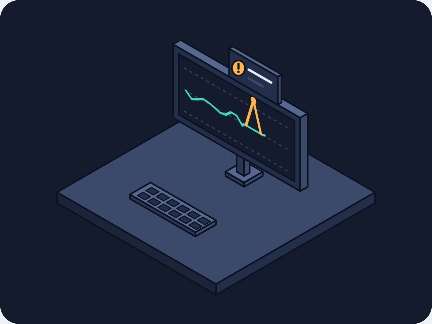
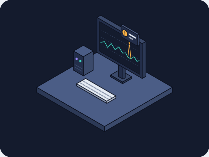
Lesson: Drawing on an isometric screen is easiest when the prompt gives the trick: 'draw the chart flat and map it onto the screen face with one SVG transform matrix, so vertical scaling keeps it on the screen' came back as a matrix and a clean scaleY wobble. Saying 'never fading' for the line and 'fades in and out once per loop' for the card kept the motion calm. Colours of small props (the keyboard) drift unless each one is named.
Facts
- Tags
- feature card css keyframes inline svg isometric flat shaded dusk
- Weight
- 1.9 KB gzip (SVG + CSS)
- Needs
- No library, no JavaScript
- Browser support
- All current browsers (Chrome, Edge, Firefox, Safari 15+); CSS transforms with transform-box on SVG groups.
- Loop
- 6 s, seamless; still frame with reduced motion
- Link
/examples/iso-dusk-alerts/
Source
Paste both parts into any page. Wrap the SVG in <div class="ma-iso-dusk-alerts"> and put the CSS in a <style> element or your stylesheet; every class, id and animation name starts with ma-iso-dusk-alerts, so it will not clash with your styles.
demo.svg
<svg xmlns="http://www.w3.org/2000/svg" viewBox="0 0 400 300" role="img" aria-labelledby="ma-iso-dusk-alerts-title">
<title id="ma-iso-dusk-alerts-title">A dark isometric monitoring screen whose line wobbles until an amber spike lifts a small alert card that settles back</title>
<rect width="400" height="300" rx="18" fill="#141B2D"/>
<g stroke="#0D1220" stroke-width="1.5" stroke-linejoin="round">
<path d="M347.2 188L200 273L200 263L347.2 178Z" fill="#232E4A"/>
<path d="M52.8 188L200 273L200 263L52.8 178Z" fill="#1B2438"/>
<path d="M200 93L347.2 178L200 263L52.8 178Z" fill="#3B4A6B"/>
<path d="M220.8 114L200 126L200 98L220.8 86Z" fill="#3B4A6B"/>
<path d="M179.2 114L200 126L200 98L179.2 86Z" fill="#2A3654"/>
<path d="M200 74L220.8 86L200 98L179.2 86Z" fill="#56688F"/>
<ellipse cx="189.6" cy="100" rx="2.4" ry="2.8" fill="#3DD9C1" stroke="none"/>
<ellipse cx="189.6" cy="110" rx="2.4" ry="2.8" fill="#9B8CFF" stroke="none"/>
<path d="M200 208L180.9 219L180.9 215L200 204Z" fill="#3B4A6B"/>
<path d="M120.3 184L180.9 219L180.9 215L120.3 180Z" fill="#2A3654"/>
<path d="M139.4 169L200 204L180.9 215L120.3 180Z" fill="#56688F"/>
<path d="M140.2 173.5L147.2 177.5L142 180.5L135 176.5Z" fill="#232E4A" stroke-width="1"/>
<path d="M149.8 179L156.7 183L151.5 186L144.6 182Z" fill="#232E4A" stroke-width="1"/>
<path d="M159.3 184.5L166.2 188.5L161 191.5L154.1 187.5Z" fill="#232E4A" stroke-width="1"/>
<path d="M168.8 190L175.8 194L170.6 197L163.6 193Z" fill="#232E4A" stroke-width="1"/>
<path d="M178.3 195.5L185.3 199.5L180.1 202.5L173.2 198.5Z" fill="#232E4A" stroke-width="1"/>
<path d="M187.9 201L194.8 205L189.6 208L182.7 204Z" fill="#232E4A" stroke-width="1"/>
<path d="M132.5 178L139.4 182L134.2 185L127.3 181Z" fill="#232E4A" stroke-width="1"/>
<path d="M142 183.5L148.9 187.5L143.7 190.5L136.8 186.5Z" fill="#232E4A" stroke-width="1"/>
<path d="M151.5 189L158.4 193L153.2 196L146.3 192Z" fill="#232E4A" stroke-width="1"/>
<path d="M161 194.5L168 198.5L162.8 201.5L155.8 197.5Z" fill="#232E4A" stroke-width="1"/>
<path d="M170.6 200L177.5 204L172.3 207L165.4 203Z" fill="#232E4A" stroke-width="1"/>
<path d="M180.1 205.5L187 209.5L181.8 212.5L174.9 208.5Z" fill="#232E4A" stroke-width="1"/>
<path d="M243.3 163L226 173L226 169L243.3 159Z" fill="#3B4A6B"/>
<path d="M208.7 163L226 173L226 169L208.7 159Z" fill="#2A3654"/>
<path d="M226 149L243.3 159L226 169L208.7 159Z" fill="#56688F"/>
<path d="M231.2 160L226 163L226 141L231.2 138Z" fill="#3B4A6B"/>
<path d="M219.1 159L226 163L226 141L219.1 137Z" fill="#2A3654"/>
<path d="M224.2 134L231.2 138L226 141L219.1 137Z" fill="#56688F"/>
<path d="M284.9 173L277.9 177L277.9 109L284.9 105Z" fill="#3B4A6B"/>
<path d="M160.2 109L277.9 177L277.9 109L160.2 41Z" fill="#232E4A"/>
<path d="M167.1 37L284.9 105L277.9 109L160.2 41Z" fill="#56688F"/>
<path d="M165.4 106L272.7 168L272.7 112L165.4 50Z" fill="#141B2D"/>
<g transform="matrix(0.8660 0.5 0 1 219.1 111)" fill="none" stroke-linecap="round">
<path d="M-56 -20H56" stroke="#3B4A6B" stroke-width="1" stroke-dasharray="2 4"/>
<path d="M-56 0H56" stroke="#3B4A6B" stroke-width="1" stroke-dasharray="2 4"/>
<path d="M-56 20H56" stroke="#3B4A6B" stroke-width="1" stroke-dasharray="2 4"/>
<g class="ma-iso-dusk-alerts-line"><path d="M-54 0L-48 6.1L-42 2.4L-36 -1.9L-30 -1.4L-24 0.3L-18 2.8L-12 1.5L-6 -5.3L0 -5.3L6 2.7L8 0M8 0H28M28 0L30 -1" stroke="#3DD9C1" stroke-width="2.4"/></g>
<g class="ma-iso-dusk-alerts-spike"><path d="M10 0L18 -27L26 0" stroke="#FFB547" stroke-width="2.6" stroke-linejoin="round"/><circle cx="18" cy="-27" r="3" fill="#FFB547" stroke="none"/></g>
</g>
<g class="ma-iso-dusk-alerts-card">
<path d="M260.6 95L257.2 97L257.2 71L260.6 69Z" fill="#3B4A6B"/>
<path d="M212.1 71L257.2 97L257.2 71L212.1 45Z" fill="#232E4A"/>
<path d="M215.6 43L260.6 69L257.2 71L212.1 45Z" fill="#56688F"/>
<ellipse cx="220.8" cy="63" rx="6" ry="7" fill="#FFB547"/>
<path d="M220.8 59L220.8 63.5" fill="none" stroke="#141B2D" stroke-width="2" stroke-linecap="round"/>
<circle cx="220.8" cy="66.4" r="1.1" fill="#141B2D" stroke="none"/>
<path d="M230.3 64.5L251.1 76.5" fill="none" stroke="#E6ECF5" stroke-width="2.2" stroke-linecap="round"/>
<path d="M230.3 72.5L243.3 80" fill="none" stroke="#3B4A6B" stroke-width="2.2" stroke-linecap="round"/>
</g>
</g>
</svg>
demo.css
/* Dark isometric alerts card (Dusk palette): the monitoring line wobbles gently, then one amber
   spike shoots up and lifts a small alert card above the screen, which settles back down and
   fades as the spike falls. Loop period 6 s. The card fades in and out once per loop and the
   line never fades, so nothing flashes. Only transform and opacity animate. */
.ma-iso-dusk-alerts svg {
  display: block;
  width: 100%;
  height: auto;
}

/* The chart is drawn flat and mapped onto the screen face, so a vertical scale keeps it on the screen. */
.ma-iso-dusk-alerts .ma-iso-dusk-alerts-line {
  transform-box: fill-box;
  transform-origin: 50% 50%;
  animation-name: ma-iso-dusk-alerts-wobble;
  animation-duration: 3s;
  animation-timing-function: ease-in-out;
  animation-iteration-count: infinite;
}

@keyframes ma-iso-dusk-alerts-wobble {
  0%, 100% { transform: scale(1, 1); }
  25% { transform: scale(1, 0.7); }
  50% { transform: scale(1, 1.2); }
  75% { transform: scale(1, 0.85); }
}

.ma-iso-dusk-alerts .ma-iso-dusk-alerts-spike,
.ma-iso-dusk-alerts .ma-iso-dusk-alerts-card {
  animation-duration: 6s;
  animation-timing-function: ease-in-out;
  animation-iteration-count: infinite;
}

.ma-iso-dusk-alerts .ma-iso-dusk-alerts-spike {
  transform-box: fill-box;
  transform-origin: 50% 100%;
  animation-name: ma-iso-dusk-alerts-spike;
}

@keyframes ma-iso-dusk-alerts-spike {
  0%, 100% { transform: scale(1, 0.15); }
  28% { transform: scale(1, 0.15); }
  36% { transform: scale(1, 1); }
  66% { transform: scale(1, 1); }
  80% { transform: scale(1, 0.15); }
}

/* The card rises out of the spike with a small overshoot, rests, then settles back and fades. */
.ma-iso-dusk-alerts .ma-iso-dusk-alerts-card {
  animation-name: ma-iso-dusk-alerts-card;
}

@keyframes ma-iso-dusk-alerts-card {
  0%, 100% { transform: translate(0, 22px); opacity: 0; }
  30% { transform: translate(0, 22px); opacity: 0; }
  40% { transform: translate(0, -4px); opacity: 1; }
  46% { transform: translate(0, 0); opacity: 1; }
  68% { transform: translate(0, 0); opacity: 1; }
  82% { transform: translate(0, 18px); opacity: 0; }
}

/* Calm still frame: the spike is up and the alert card rests above it. */
@media (prefers-reduced-motion: reduce) {
  .ma-iso-dusk-alerts,
  .ma-iso-dusk-alerts * {
    animation: none !important;
  }
}