All examples / feature card
Isometric collaboration: two cursors, one board
A shared board with a grid of card slots sits on an isometric platform; a mint cursor and a coral cursor take turns carrying a card in, setting it down in an empty slot with a soft glow, and drifting away.
Prompt tested
Feature card size
Prompt
Draw a looping isometric illustration for a 'Collaboration' feature card as one inline SVG with CSS keyframes only (no JavaScript, no libraries). Scene: a light paper-coloured isometric platform (30° projection) with a low, light-grey shared board lying flat on it. The board holds a 3 × 2 grid of slots outlined with thin dashed lines; three slots already hold flat cards (light blue, slate, warm yellow), each a thin isometric slab with two short white text lines. Two flat arrow cursors, one mint and one coral, each with a small rounded name pill beside it, take turns: a cursor carries a matching card (mint or coral) in from outside the board, the card held slightly lifted, sets it down in an empty slot, the slot glows softly, then the cursor lets go and drifts away and fades. The placed card rests, then fades so the slot is free for the next round. The coral cursor runs half a loop after the mint one. Use a navy outline (#1F2A44, 1.5 px, round joins) and the palette ink #1F2A44, slate #5B6B8C, sky #7FB6FF, mint #6FD6B4, sun #FFC861, coral #FF8A7A, paper #F6F4EF; shade each slab with a light top, mid right face and darker left face. Loop every 6 seconds with no visible jump; animate only transform and opacity; add a prefers-reduced-motion rule that stops all animation and leaves a calm still frame with both cards placed and each cursor resting on its card.
Prompt test
A fresh AI session given only the prompt above rebuilt this on 2026-11-03 using claude-opus-5-5; a separate fresh session using claude-opus-5-5 judged it “like this”.
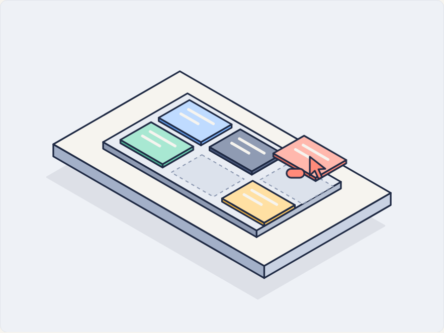
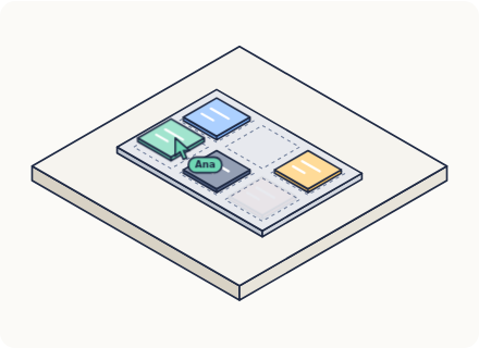
Lesson: Spelling out the turn-taking as a sequence (carry in lifted, set down, slot glows, let go and drift, card fades so the slot is free) plus "half a loop after" for the second cursor gave the same choreography first time; the rebuild filled open details its own way (name text in the pills, cursors entering from the front, a smaller board).
Words it rests on
- isometric illustration (30° projection)
- inline SVG
- CSS @keyframes
- seamless loop
- half-period offset (negative animation-delay)
- lift and drop (translate on two axes)
- three-tone face shading
- prefers-reduced-motion still frame
- feature card
Facts
- Tags
- feature card css keyframes inline svg isometric flat shaded harbor
- Weight
- 1.8 KB gzip (SVG + CSS)
- Needs
- No library, no JavaScript
- Browser support
- All current browsers (Chrome, Edge, Firefox, Safari 15+); CSS transforms on SVG groups.
- Loop
- 6 s, seamless; still frame with reduced motion
- Link
/examples/iso-collaboration/
Source
Paste both parts into any page. Wrap the SVG in <div class="ma-iso-collaboration"> and put the CSS in a <style> element or your stylesheet; every class, id and animation name starts with ma-iso-collaboration, so it will not clash with your styles.
demo.svg
<svg xmlns="http://www.w3.org/2000/svg" viewBox="0 0 400 300" role="img" aria-labelledby="ma-iso-collaboration-title">
<title id="ma-iso-collaboration-title">Two cursors placing cards onto a shared isometric board</title>
<g stroke="#1F2A44" stroke-width="1.5" stroke-linejoin="round">
<path d="M156.3 93.7L346.8 203.7L232.5 269.7L42 159.7Z" fill="#1F2A44" opacity=".08"/>
<path d="M352.5 185L238.2 251L238.2 240L352.5 174Z" fill="#C9D2E3"/>
<path d="M47.7 141L238.2 251L238.2 240L47.7 130Z" fill="#A3B0C8"/>
<path d="M162 64L352.5 174L238.2 240L47.7 130Z" fill="#F6F4EF"/>
<path d="M307.5 170L231.3 214L231.3 208L307.5 164Z" fill="#B7C1D3"/>
<path d="M92.7 134L231.3 214L231.3 208L92.7 128Z" fill="#8F9BB3"/>
<path d="M168.9 84L307.5 164L231.3 208L92.7 128Z" fill="#E8ECF3"/>
<path d="M170.7 93L208.8 115L181.1 131L142.9 109Z" fill="#DCE2EC" stroke-dasharray="3 3" stroke="#8F9BB3" stroke-width="1"/>
<path d="M136 113L174.1 135L146.4 151L108.3 129Z" fill="#DCE2EC" stroke-dasharray="3 3" stroke="#8F9BB3" stroke-width="1"/>
<path d="M216.6 119.5L254.7 141.5L227 157.5L188.8 135.5Z" fill="#DCE2EC" stroke-dasharray="3 3" stroke="#8F9BB3" stroke-width="1"/>
<path d="M181.9 139.5L220 161.5L192.3 177.5L154.2 155.5Z" fill="#DCE2EC" stroke-dasharray="3 3" stroke="#8F9BB3" stroke-width="1"/>
<path d="M262.5 146L300.6 168L272.9 184L234.7 162Z" fill="#DCE2EC" stroke-dasharray="3 3" stroke="#8F9BB3" stroke-width="1"/>
<path d="M227.8 166L265.9 188L238.2 204L200.1 182Z" fill="#DCE2EC" stroke-dasharray="3 3" stroke="#8F9BB3" stroke-width="1"/>
<g>
<path d="M208.8 115L181.1 131L181.1 128L208.8 112Z" fill="#7FB6FF"/>
<path d="M142.9 109L181.1 131L181.1 128L142.9 106Z" fill="#5E98E6"/>
<path d="M170.7 90L208.8 112L181.1 128L142.9 106Z" fill="#BFDBFF"/>
<path d="M169.8 98.5L192.3 111.5" stroke="#F6F4EF" stroke-width="2.5" stroke-linecap="round"/>
<path d="M162.9 102.5L178.5 111.5" stroke="#F6F4EF" stroke-width="2.5" stroke-linecap="round"/>
</g>
<g>
<path d="M265.9 188L238.2 204L238.2 201L265.9 185Z" fill="#FFC861"/>
<path d="M200.1 182L238.2 204L238.2 201L200.1 179Z" fill="#E8AC3E"/>
<path d="M227.8 163L265.9 185L238.2 201L200.1 179Z" fill="#FFE0A3"/>
<path d="M227 171.5L249.5 184.5" stroke="#F6F4EF" stroke-width="2.5" stroke-linecap="round"/>
<path d="M220 175.5L235.6 184.5" stroke="#F6F4EF" stroke-width="2.5" stroke-linecap="round"/>
</g>
<g>
<path d="M254.7 141.5L227 157.5L227 154.5L254.7 138.5Z" fill="#5B6B8C"/>
<path d="M188.8 135.5L227 157.5L227 154.5L188.8 132.5Z" fill="#47567A"/>
<path d="M216.6 116.5L254.7 138.5L227 154.5L188.8 132.5Z" fill="#8F9BB3"/>
<path d="M215.7 125L238.2 138" stroke="#F6F4EF" stroke-width="2.5" stroke-linecap="round"/>
<path d="M208.8 129L224.4 138" stroke="#F6F4EF" stroke-width="2.5" stroke-linecap="round"/>
</g>
<g class="ma-iso-collaboration-glow ma-iso-collaboration-glow-a" opacity="0"><path d="M136 113L174.1 135L146.4 151L108.3 129Z" fill="#6FD6B4" stroke="none"/></g>
<g class="ma-iso-collaboration-glow ma-iso-collaboration-glow-b" opacity="0"><path d="M262.5 146L300.6 168L272.9 184L234.7 162Z" fill="#FF8A7A" stroke="none"/></g>
<g class="ma-iso-collaboration-card ma-iso-collaboration-card-a">
<g>
<path d="M174.1 135L146.4 151L146.4 148L174.1 132Z" fill="#6FD6B4"/>
<path d="M108.3 129L146.4 151L146.4 148L108.3 126Z" fill="#4FB896"/>
<path d="M136 110L174.1 132L146.4 148L108.3 126Z" fill="#A8E8D2"/>
<path d="M135.2 118.5L157.7 131.5" stroke="#F6F4EF" stroke-width="2.5" stroke-linecap="round"/>
<path d="M128.2 122.5L143.8 131.5" stroke="#F6F4EF" stroke-width="2.5" stroke-linecap="round"/>
</g>
</g>
<g class="ma-iso-collaboration-card ma-iso-collaboration-card-b">
<g>
<path d="M300.6 168L272.9 184L272.9 181L300.6 165Z" fill="#FF8A7A"/>
<path d="M234.7 162L272.9 184L272.9 181L234.7 159Z" fill="#E06A5B"/>
<path d="M262.5 143L300.6 165L272.9 181L234.7 159Z" fill="#FFB8AD"/>
<path d="M261.6 151.5L284.1 164.5" stroke="#F6F4EF" stroke-width="2.5" stroke-linecap="round"/>
<path d="M254.7 155.5L270.3 164.5" stroke="#F6F4EF" stroke-width="2.5" stroke-linecap="round"/>
</g>
</g>
<g class="ma-iso-collaboration-cursor ma-iso-collaboration-cursor-a">
<path d="M141.2 129l0 17l4.5-4.3l3.4 7.4l3.2-1.5l-3.3-7.2l6.2-.4Z" fill="#6FD6B4"/>
<rect x="156.2" y="140" width="16" height="8" rx="4" fill="#6FD6B4"/>
</g>
<g class="ma-iso-collaboration-cursor ma-iso-collaboration-cursor-b">
<path d="M267.7 162l0 17l4.5-4.3l3.4 7.4l3.2-1.5l-3.3-7.2l6.2-.4Z" fill="#FF8A7A"/>
<rect x="246.7" y="173" width="16" height="8" rx="4" fill="#FF8A7A"/>
</g>
</g>
</svg>
demo.css
/* Isometric collaboration card: two cursors take turns placing a card on a shared board.
   Loop period 6 s; cursor B runs half a period after cursor A. Only transform and opacity animate. */
.ma-iso-collaboration svg {
  display: block;
  width: 100%;
  height: auto;
}

.ma-iso-collaboration .ma-iso-collaboration-card,
.ma-iso-collaboration .ma-iso-collaboration-cursor,
.ma-iso-collaboration .ma-iso-collaboration-glow {
  animation-duration: 6s;
  animation-timing-function: ease-in-out;
  animation-iteration-count: infinite;
}

.ma-iso-collaboration .ma-iso-collaboration-card-a { animation-name: ma-iso-collaboration-card-a; }
.ma-iso-collaboration .ma-iso-collaboration-cursor-a { animation-name: ma-iso-collaboration-cursor-a; }
.ma-iso-collaboration .ma-iso-collaboration-glow-a { animation-name: ma-iso-collaboration-glow; }
.ma-iso-collaboration .ma-iso-collaboration-card-b { animation-name: ma-iso-collaboration-card-b; }
.ma-iso-collaboration .ma-iso-collaboration-cursor-b { animation-name: ma-iso-collaboration-cursor-b; }
.ma-iso-collaboration .ma-iso-collaboration-glow-b { animation-name: ma-iso-collaboration-glow; }

.ma-iso-collaboration .ma-iso-collaboration-card-a,
.ma-iso-collaboration .ma-iso-collaboration-cursor-a,
.ma-iso-collaboration .ma-iso-collaboration-glow-a {
  animation-delay: -2.5s;
}

.ma-iso-collaboration .ma-iso-collaboration-card-b,
.ma-iso-collaboration .ma-iso-collaboration-cursor-b,
.ma-iso-collaboration .ma-iso-collaboration-glow-b {
  animation-delay: -5.5s;
}

/* A card is carried in lifted, set down in its slot, rests, then fades so the slot is free again. */
@keyframes ma-iso-collaboration-card-a {
  0%, 100% { transform: translate(-34.6px, -34px); opacity: 0; }
  8% { transform: translate(-34.6px, -34px); opacity: 1; }
  30% { transform: translate(0px, -14px); opacity: 1; }
  38% { transform: translate(0px, 0px); opacity: 1; }
  85% { transform: translate(0px, 0px); opacity: 1; }
  95% { transform: translate(0px, 0px); opacity: 0; }
}

@keyframes ma-iso-collaboration-card-b {
  0%, 100% { transform: translate(34.6px, -34px); opacity: 0; }
  8% { transform: translate(34.6px, -34px); opacity: 1; }
  30% { transform: translate(0px, -14px); opacity: 1; }
  38% { transform: translate(0px, 0px); opacity: 1; }
  85% { transform: translate(0px, 0px); opacity: 1; }
  95% { transform: translate(0px, 0px); opacity: 0; }
}

/* The cursor travels with its card, lets go, and drifts away. */
@keyframes ma-iso-collaboration-cursor-a {
  0%, 100% { transform: translate(-34.6px, -34px); opacity: 0; }
  8% { transform: translate(-34.6px, -34px); opacity: 1; }
  30% { transform: translate(0px, -14px); opacity: 1; }
  38% { transform: translate(0px, 0px); opacity: 1; }
  48% { transform: translate(0px, 0px); opacity: 1; }
  62% { transform: translate(-22px, -26px); opacity: 1; }
  70% { transform: translate(-22px, -26px); opacity: 0; }
}

@keyframes ma-iso-collaboration-cursor-b {
  0%, 100% { transform: translate(34.6px, -34px); opacity: 0; }
  8% { transform: translate(34.6px, -34px); opacity: 1; }
  30% { transform: translate(0px, -14px); opacity: 1; }
  38% { transform: translate(0px, 0px); opacity: 1; }
  48% { transform: translate(0px, 0px); opacity: 1; }
  62% { transform: translate(22px, -26px); opacity: 1; }
  70% { transform: translate(22px, -26px); opacity: 0; }
}

/* The slot glows softly as the card lands. */
@keyframes ma-iso-collaboration-glow {
  0%, 100% { opacity: 0; }
  34% { opacity: 0; }
  42% { opacity: 0.55; }
  60% { opacity: 0; }
}

/* Calm still frame: both cards placed, each cursor resting on its card. */
@media (prefers-reduced-motion: reduce) {
  .ma-iso-collaboration,
  .ma-iso-collaboration * {
    animation: none !important;
  }
}