All examples / feature card
Isometric backup: files slide into a vault (Web Animations API, speeds up on hover)
A laptop and a vault on an isometric platform. Every 2 s a file slides along a track into the vault door while the door light breathes. The motion is made with the Web Animations API, so the whole loop can speed up while the pointer is over the card and ease back when it leaves.
Prompt tested
Feature card size
Prompt
Draw a looping isometric illustration for a 'Backups' feature card as one inline SVG, animated with the Web Animations API (element.animate() from a tiny JavaScript module; no CSS keyframes, no libraries). Scene: a light paper-coloured isometric platform (30° projection) with a soft shadow. At the back left stands a tall grey-blue vault box; on its right-facing side (drawn in that face's plane with a matrix transform) is a round vault door: a rounded square frame, two rings, a navy three-spoke wheel with a slate hub, a short navy slot under the wheel, and a small mint lamp above it. On the vault's left face sit three short coloured bars (mint, sky, yellow) like a storage gauge. At the front right lies an open laptop: a flat base with a recessed keyboard plate, and its lid standing up along the back edge with a sky-blue screen showing three paper-coloured lines, facing the viewer. A pale floor track with a dashed sky line runs from the laptop's left side to the vault door. Motion, one 6-second loop: every 2 s a small upright document (sky, then mint, then yellow, with a folded corner and white text lines) fades in beside the laptop, slides along the track to the vault door, then shrinks from its bottom edge and fades as it goes in; the vault lamp breathes (opacity 1 to 0.35 and back, 2 s) and the laptop screen flashes faintly as each file leaves. Use element.animate(keyframes, { duration, iterations: Infinity }) with only transform and opacity, durations of 2 s or 6 s, the first and last keyframe equal, and the stagger written as keyframe offsets inside each file's 6 s animation (not delays). Make it react to hover: export HOVER_RATE = 1.5 and, while the pointer is over the card (listen only when matchMedia('(hover: hover)') matches) or focus is inside it, call updatePlaybackRate(HOVER_RATE) on every animation, and updatePlaybackRate(1) on leave. Export mount(root) that returns { play, pause } mapped to the animations' play() and pause(). Under prefers-reduced-motion start nothing, so the still frame stays: one sky file halfway along the track, the other two hidden, the lamp on. Use a navy outline (#1F2A44, 1.5 px, round joins) and the palette ink #1F2A44, slate #5B6B8C, sky #7FB6FF, mint #6FD6B4, sun #FFC861, coral #FF8A7A, paper #F6F4EF; shade each box with a light top, mid right face and darker left face.
Words it rests on
- isometric illustration (30° projection)
- inline SVG
- Web Animations API (element.animate())
- iterations: Infinity
- keyframe offsets for a stagger
- updatePlaybackRate() on hover and focus
- (hover: hover) media query
- animation.play() / animation.pause()
- drawing in an isometric plane (matrix transform)
- prefers-reduced-motion still frame
- feature card
Prompt test
A fresh AI session given only this prompt rebuilt this on 2026-11-04 using claude-opus-5-5; a separate fresh session using claude-opus-5-5 judged it “like this”.

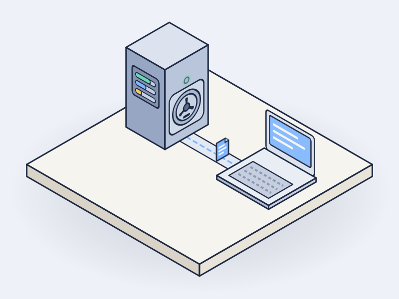
Lesson: For the Web Animations API, naming the contract (element.animate() with iterations: Infinity, equal first and last keyframes, the stagger as keyframe offsets instead of delays, updatePlaybackRate() on hover only when (hover: hover) matches, and play()/pause() handles) got a rebuild that keeps every motion rule and speeds up on hover on the first try; the proportions that were left loose (vault height, platform shape and side colour) drifted, so name them when the silhouette matters.
Facts
- Tags
- feature card waapi inline svg isometric flat shaded harbor
- Weight
- 2.3 KB gzip (SVG + CSS + JS)
- Needs
- No library; a small JavaScript module
- Browser support
- All current browsers (Chrome, Edge, Firefox, Safari 13.1+): Web Animations API (element.animate, updatePlaybackRate) on SVG groups, run by a small ES module.
- Loop
- 6 s, seamless; still frame with reduced motion
- Link
/examples/iso-backup/
Source
Paste all three parts into any page. Wrap the SVG in <div class="ma-iso-backup"> and put the CSS in a <style> element or your stylesheet; every class, id and animation name starts with ma-iso-backup, so it will not clash with your styles.
demo.svg
<svg xmlns="http://www.w3.org/2000/svg" viewBox="0 0 400 300" role="img" aria-labelledby="ma-iso-backup-title">
<title id="ma-iso-backup-title">Files sliding from a laptop into an isometric vault whose door light glows</title>
<g stroke="#1F2A44" stroke-width="1.5" stroke-linejoin="round">
<path d="M156.3 93.7L346.8 203.7L232.5 269.7L42 159.7Z" fill="#1F2A44" opacity=".08"/>
<path d="M352.5 185L238.2 251L238.2 240L352.5 174Z" fill="#C9D2E3"/>
<path d="M47.7 141L238.2 251L238.2 240L47.7 130Z" fill="#A3B0C8"/>
<path d="M162 64L352.5 174L238.2 240L47.7 130Z" fill="#F6F4EF"/>
<path d="M184.5 127L227.8 152L207 164L163.7 139Z" fill="#E6E9F0"/>
<path d="M177.6 135L215.7 157" fill="none" stroke="#7FB6FF" stroke-width="2" stroke-dasharray="4 6" stroke-linecap="round"/>
<g class="ma-iso-backup-vault">
<path d="M212.2 111L141.2 152L141.2 82L212.2 41Z" fill="#B7C1D3"/>
<path d="M89.3 122L141.2 152L141.2 82L89.3 52Z" fill="#8F9BB3"/>
<path d="M160.3 11L212.2 41L141.2 82L89.3 52Z" fill="#E8ECF3"/>
<path d="M160.3 19L198.4 41L141.2 74L103.1 52Z" fill="#DDE3EE"/>
<g transform="matrix(.866 -.5 0 1 176.7 95.5)">
<rect x="-32" y="-31" width="64" height="62" rx="6" fill="#C9D2E3"/>
<circle r="23" fill="#E8ECF3"/>
<circle r="16" fill="#C9D2E3"/>
<path d="M0 -12V12M-10.4 -6L10.4 6M-10.4 6L10.4 -6" fill="none" stroke-width="3" stroke-linecap="round"/>
<circle r="4.5" fill="#5B6B8C"/>
<rect x="-11" y="25" width="22" height="4" rx="2" fill="#1F2A44" stroke="none"/>
<g class="ma-iso-backup-lamp"><circle cx="0" cy="-27" r="3" fill="#6FD6B4"/></g>
</g>
<g transform="matrix(.866 .5 0 1 96.2 68)" stroke="none">
<rect x="0" y="0" width="30" height="4" rx="2" fill="#6FD6B4"/>
<rect x="0" y="9" width="30" height="4" rx="2" fill="#7FB6FF"/>
<rect x="0" y="18" width="18" height="4" rx="2" fill="#FFC861"/>
</g>
</g>
<g class="ma-iso-backup-file ma-iso-backup-file-1" transform="translate(-17.3 -10)">
<g transform="matrix(.866 .5 0 1 212.2 155)">
<path d="M-9 0V-25H4L9 -20V0Z" fill="#7FB6FF"/>
<path d="M4 -25V-20H9" fill="none" stroke-width="1.2"/>
<path d="M-5 -16H4M-5 -11H4M-5 -6H1" fill="none" stroke="#F6F4EF" stroke-width="1.6" stroke-linecap="round"/>
</g></g>
<g class="ma-iso-backup-file ma-iso-backup-file-2" opacity="0">
<g transform="matrix(.866 .5 0 1 212.2 155)">
<path d="M-9 0V-25H4L9 -20V0Z" fill="#6FD6B4"/>
<path d="M4 -25V-20H9" fill="none" stroke-width="1.2"/>
<path d="M-5 -16H4M-5 -11H4M-5 -6H1" fill="none" stroke="#F6F4EF" stroke-width="1.6" stroke-linecap="round"/>
</g></g>
<g class="ma-iso-backup-file ma-iso-backup-file-3" opacity="0">
<g transform="matrix(.866 .5 0 1 212.2 155)">
<path d="M-9 0V-25H4L9 -20V0Z" fill="#FFC861"/>
<path d="M4 -25V-20H9" fill="none" stroke-width="1.2"/>
<path d="M-5 -16H4M-5 -11H4M-5 -6H1" fill="none" stroke="#F6F4EF" stroke-width="1.6" stroke-linecap="round"/>
</g></g>
<g class="ma-iso-backup-laptop">
<path d="M288.4 177L226.1 213L226.1 208L288.4 172Z" fill="#B7C1D3"/>
<path d="M175.9 184L226.1 213L226.1 208L175.9 179Z" fill="#8F9BB3"/>
<path d="M238.2 143L288.4 172L226.1 208L175.9 179Z" fill="#E8ECF3"/>
<path d="M238.2 155L269.4 173L227.8 197L196.6 179Z" fill="#C9D2E3"/>
<path d="M291.9 170L288.4 172L288.4 115L291.9 113Z" fill="#8F9BB3"/>
<path d="M238.2 143L288.4 172L288.4 115L238.2 86Z" fill="#5B6B8C"/>
<path d="M241.7 84L291.9 113L288.4 115L238.2 86Z" fill="#E8ECF3"/>
<g transform="matrix(.866 .5 0 1 263.3 128.5)">
<rect x="-32" y="-25" width="64" height="48" fill="#7FB6FF"/>
<path d="M-24 -14H18M-24 -3H4M-24 8H18" fill="none" stroke="#F6F4EF" stroke-width="3" stroke-linecap="round" opacity=".9"/>
<g class="ma-iso-backup-glow" opacity=".2"><rect x="-32" y="-25" width="64" height="48" fill="#F6F4EF" stroke="none"/></g>
</g>
</g>
</g>
</svg>
demo.css
/* Isometric backup card. The motion is created by demo.js with the Web Animations API (6 s loop):
   a file slides from the laptop into the vault every 2 s, the vault's door light breathes, and the
   loop speeds up while the pointer is over the card. This file only holds static styles; the
   markup's resting state is the still frame: one file on its way, the door light on. */
.ma-iso-backup svg {
  display: block;
  width: 100%;
  height: auto;
}

/* Files shrink toward their bottom edge as they enter the vault. */
.ma-iso-backup .ma-iso-backup-file {
  transform-box: fill-box;
  transform-origin: 50% 100%;
}

/* Calm still frame: demo.js starts nothing under reduced motion; this keeps any CSS still too. */
@media (prefers-reduced-motion: reduce) {
  .ma-iso-backup,
  .ma-iso-backup * {
    animation: none !important;
  }
}
The motion lives in a small module. Load it with <script type="module"> and start it with mount(document.querySelector('.ma-iso-backup')); it returns { play, pause } and starts nothing when the visitor prefers reduced motion.
demo.js
// Animates the backup card with the Web Animations API: a file slides from the laptop into the
// vault every 2 s and the door light breathes, on one 6 s loop. While the pointer is over the card
// (or focus is inside it) the loop runs at HOVER_RATE and eases back when it leaves. When the
// visitor prefers reduced motion (prefers-reduced-motion: reduce) nothing starts and the drawing
// keeps its still frame.
export const HOVER_RATE = 1.5;

const PERIOD = 6000;
const DX = -34.6; // laptop to vault door, along the floor track
const DY = -20;

// One file's trip, starting at fraction `s` of the loop. First and last frames are equal.
function trip(s) {
  const at = (x, y, k) => `translate(${x}px, ${y}px) scale(${k})`;
  const home = at(0, 0, 1);
  const door = at(DX, DY, 1);
  return [
    { offset: 0, transform: home, opacity: 0 },
    { offset: s, transform: home, opacity: 0 },
    { offset: s + 0.04, transform: home, opacity: 1, easing: 'ease-in-out' },
    { offset: s + 0.24, transform: door, opacity: 1 },
    { offset: s + 0.29, transform: at(DX * 1.08, DY * 1.08, 0.6), opacity: 0 },
    { offset: s + 0.3, transform: home, opacity: 0 },
    { offset: 1, transform: home, opacity: 0 },
  ];
}

export function mount(root, options = {}) {
  const mm = options.matchMedia ?? (globalThis.matchMedia ? (q) => globalThis.matchMedia(q) : undefined);
  const reduced = options.reduced ?? (mm ? mm('(prefers-reduced-motion: reduce)').matches : false);
  const anims = [];
  if (!reduced) {
    const loop = { duration: PERIOD, iterations: Infinity };
    root.querySelectorAll('.ma-iso-backup-file').forEach((el, i) => {
      anims.push(el.animate(trip(i / 3), loop));
    });
    const lamp = root.querySelector('.ma-iso-backup-lamp');
    if (lamp) {
      anims.push(lamp.animate([{ opacity: 1 }, { opacity: 0.35 }, { opacity: 1 }], { duration: 2000, iterations: Infinity, easing: 'ease-in-out' }));
    }
    const glow = root.querySelector('.ma-iso-backup-glow');
    if (glow) {
      anims.push(glow.animate([{ opacity: 0.5 }, { opacity: 0.1, offset: 0.3 }, { opacity: 0.5 }], { duration: 2000, iterations: Infinity }));
    }
    const rate = (r) => () => anims.forEach((a) => a.updatePlaybackRate(r));
    if (mm && mm('(hover: hover)').matches) {
      root.addEventListener('pointerenter', rate(HOVER_RATE));
      root.addEventListener('pointerleave', rate(1));
    }
    root.addEventListener('focusin', rate(HOVER_RATE));
    root.addEventListener('focusout', rate(1));
  }
  return {
    play() {
      anims.forEach((a) => a.play());
    },
    pause() {
      anims.forEach((a) => a.pause());
    },
  };
}